
31 Best 404 Page Examples & Creative Error Pages 2026

A good 404 page admits the mistake quickly, sounds like the brand, and gives the visitor an obvious way forward. These 31 404 page examples come from LEGO, Pixar, GitHub, Slack, NASA, Netflix, Stripe and more, grouped by approach: character illustrations, playful ideas, big visuals and quiet, helpful pages. Each entry links to the live error page and lists the way back it offers. Need a ready-made one? Browse our free 404 page templates.
We opened every site at a made-up address in a real browser, so each screenshot is the real error page a visitor sees today. We also checked what the server returns: every page here sends a proper 404 status except one, which is worth knowing before you copy it.
Illustrated and Character 404 Pages
The most memorable error pages put a character or an illustration between the visitor and their frustration, often one the audience already knows.
1. LEGO
Way back: Back to homepage button and site search
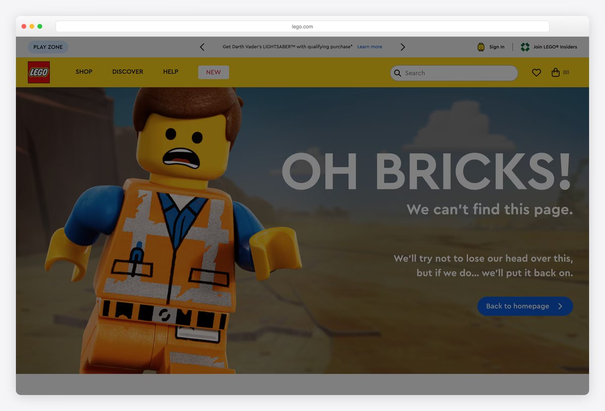
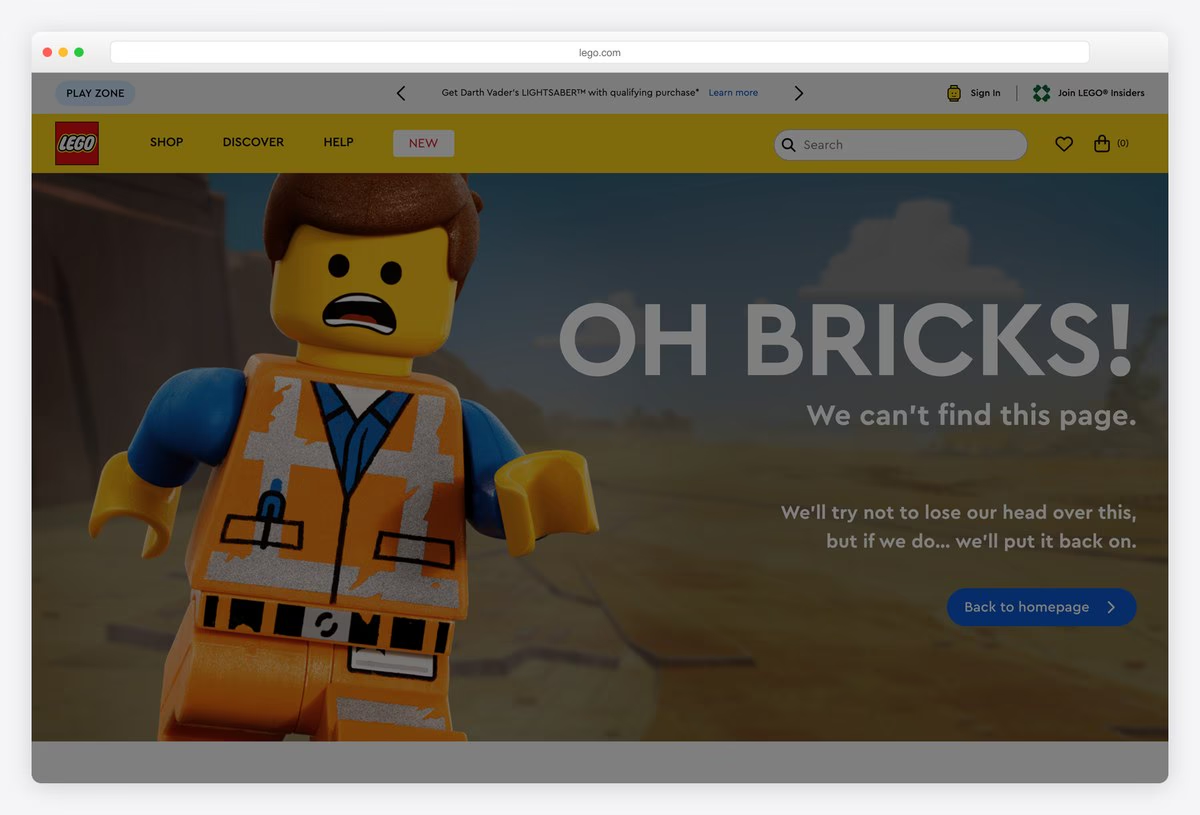
LEGO opens its 404 with a minifigure caught mid-panic, one hand on its head, and the line “OH BRICKS!” in huge letters. The joke continues in the copy: the team will try not to lose their heads over the missing page, “but if we do… we’ll put it back on.”
A Back to homepage button sits under the joke, and the full LEGO header with search stays in place, so a shopper can carry on without starting over.
What stands out: A joke only LEGO could make, told by its own toy.
2. Pixar
Way back: Link back to “Headquarters”
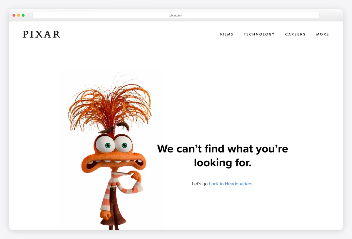
Pixar uses one of its own characters for its 404: a large, wide-eyed figure from Inside Out stands next to the message “We can’t find what you’re looking for.” The page is otherwise white, with Pixar’s spaced-out wordmark at the top.
The only way forward is a link back to Headquarters, a nice touch for a studio known for its campus. It shows how much a single character from a brand’s own world can do.
What stands out: One beloved character carries the whole page.
3. Marvel
Way back: Site search and a prompt to go back
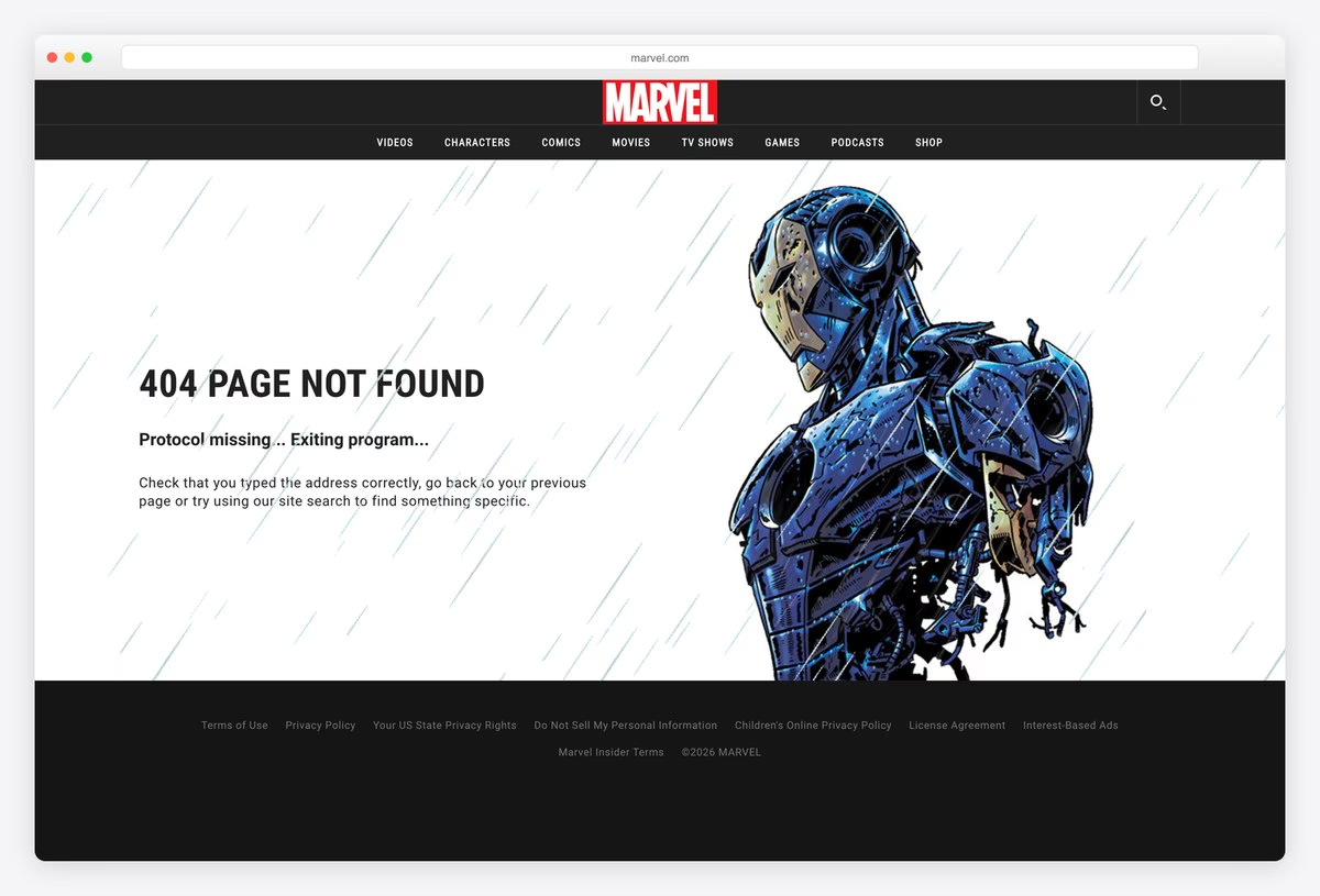
Marvel’s 404 shows an armoured hero falling apart into fragments against a rain-streaked background, with “404 PAGE NOT FOUND” and the subtitle Protocol missing… Exiting program… in a monospaced, system-error style.
The copy then becomes practical, telling visitors to check the address, go back or use the site search in the header. Dramatic art plus plain advice is a good balance for an entertainment brand.
What stands out: A dramatic illustration paired with plain, useful advice.
4. Airbnb
Way back: Seven helpful links, from Search to Trust & Safety
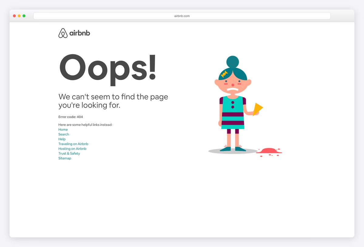
Airbnb’s 404 is a large “Oops!” beside an illustration of a girl holding a melting ice cream, its scoop on the floor, a small moment of bad luck that matches the visitor’s.
Underneath, the page lists seven plain links (Home, Search, Help, Traveling on Airbnb, Hosting on Airbnb, Trust & Safety and Sitemap) and even shows the error code, which helps support teams.
What stands out: An illustrated mishap and a full list of ways out.
5. GitHub
Way back: Code search, Support and Status links
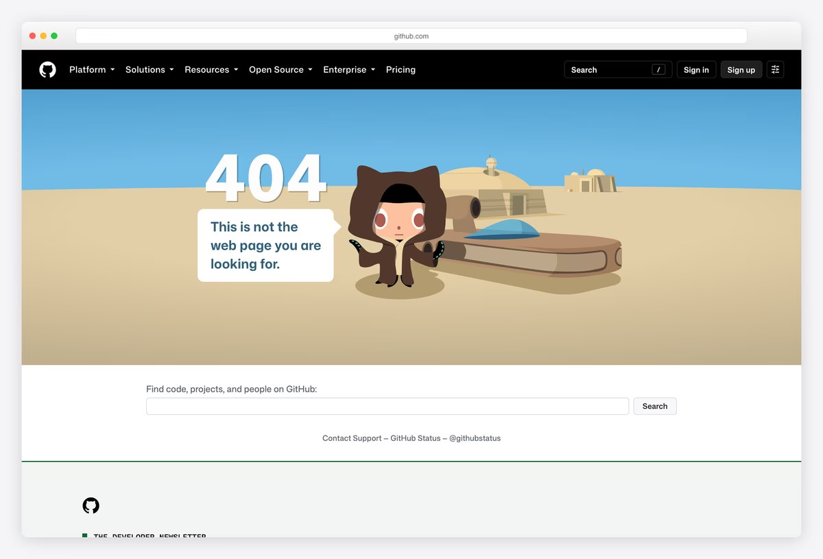
GitHub’s 404 is a scene from its Star Wars parody: the Octocat in desert robes stands by a landspeeder under a big 404, with the line “This is not the web page you are looking for.”
Below the scene, a search box finds code, projects and people, and links lead to Support and the GitHub Status page, which is exactly where a developer goes next when a link breaks.
What stands out: A pop-culture joke with a developer’s search box underneath.
6. Hootsuite
Way back: Eight links, from Homepage to Compare Plans
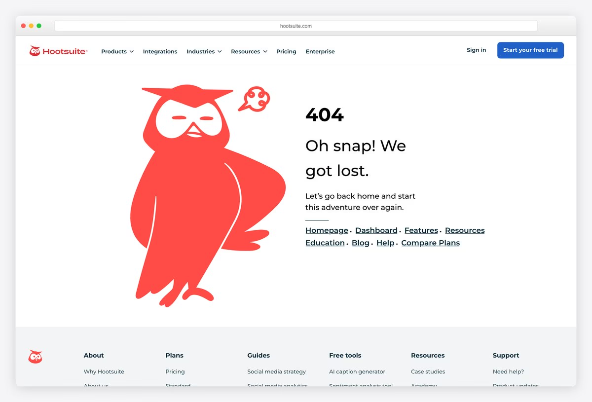
Hootsuite puts its red owl mascot, looking sheepish, beside a big 404 and the headline “Oh snap! We got lost.” The tone is friendly and short.
Eight links (Homepage, Dashboard, Features, Resources, Education, Blog, Help and Compare Plans) cover both logged-in customers and new visitors, so nobody has to scroll to the footer. Using a mascot that already appears across the product keeps even the error page recognisably Hootsuite.
What stands out: A mascot with a sorry face and links for every visitor type.
7. Bitly
Way back: Advice on mistyped links, plus Help Center link
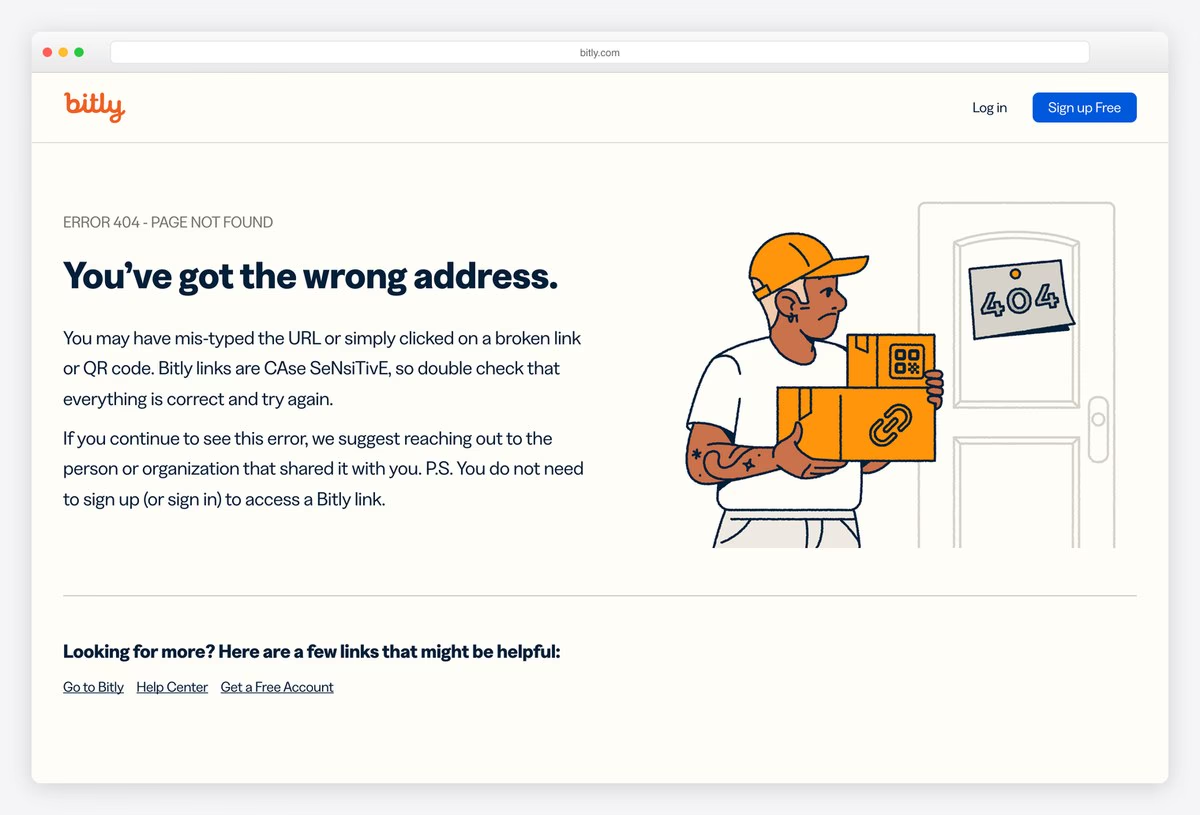
Bitly’s 404 shows a delivery person holding a parcel stamped with a QR code at the wrong door, marked 404, with the headline “You’ve got the wrong address.”
The copy is unusually helpful for a link shortener: it explains that Bitly links are case sensitive, mentions broken QR codes and tells visitors to contact whoever shared the link. Help Center and homepage links follow.
What stands out: Error copy that explains the most likely cause.
8. Dropbox
Way back: Six helpful links, including Help center
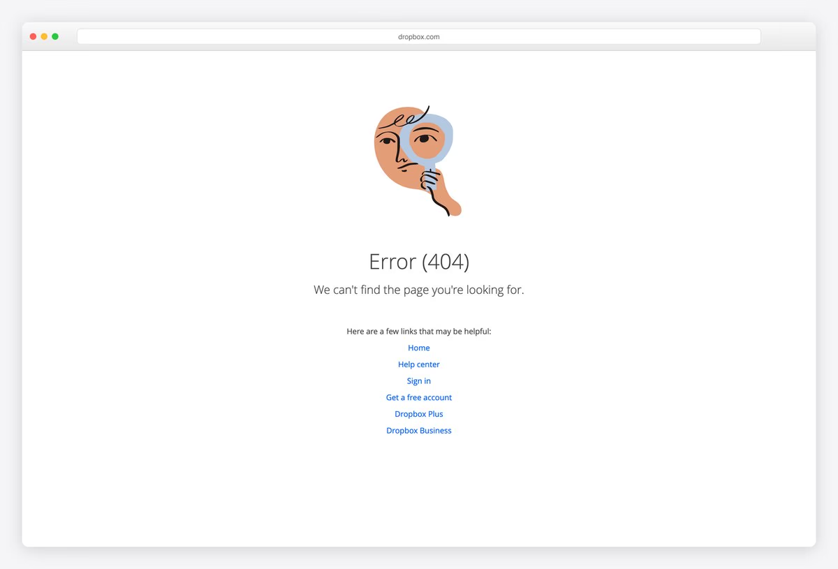
Dropbox keeps its 404 calm: a simple illustration of a figure peering through a magnifying glass, the heading Error (404) and a short apology.
A centred column of six links follows: Home, Help center, Sign in, Get a free account, Dropbox Plus and Dropbox Business. It is a tidy example of a page that apologises once and then gets out of the way.
What stands out: A calm illustration and a short, centred list of exits.
9. Monzo
Way back: One Visit the homepage button
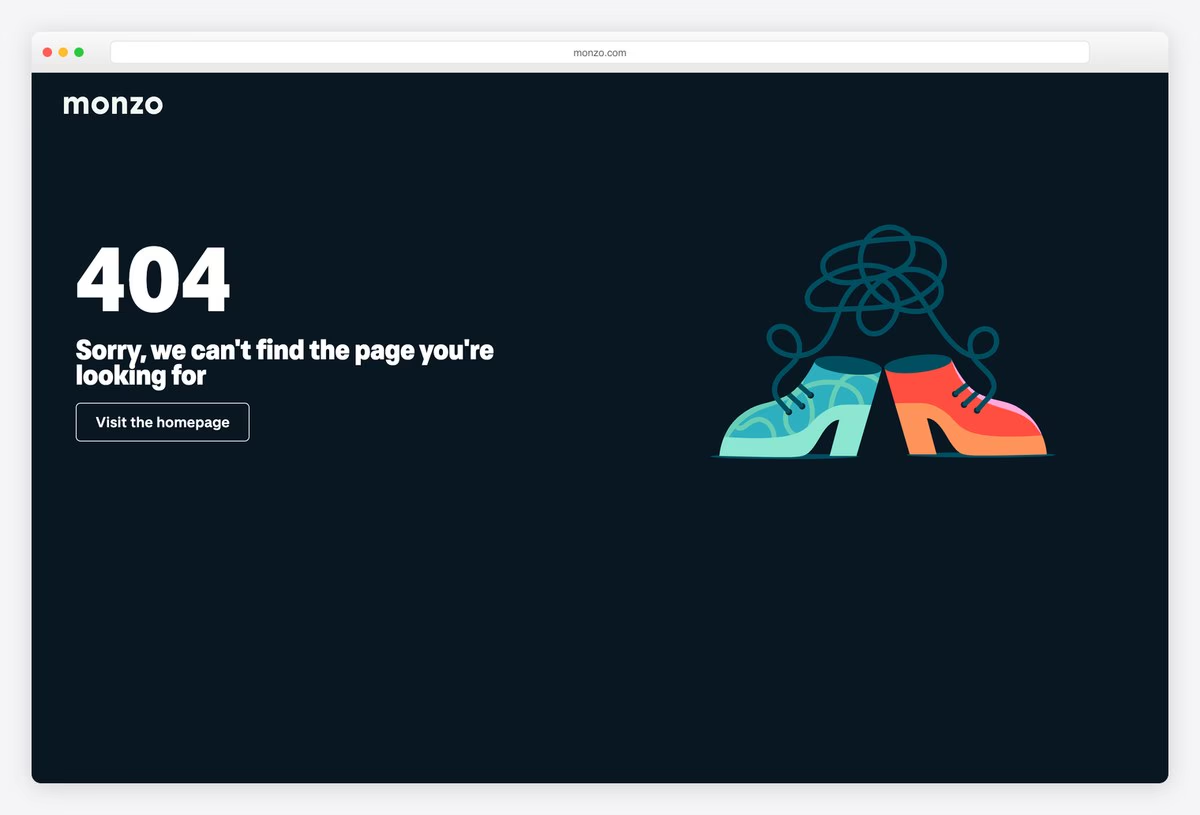
Monzo’s 404 sits on the bank’s dark navy background, with a big white 404, a short apology and an illustration of two cartoon shoes with their laces tangled into a scribble.
There is only one action, a Visit the homepage button, which suits a banking app where most visitors want the main site or the app, not a menu.
What stands out: Tangled shoelaces and a single, obvious button.
10. Lyft
Way back: A Back link above the full footer
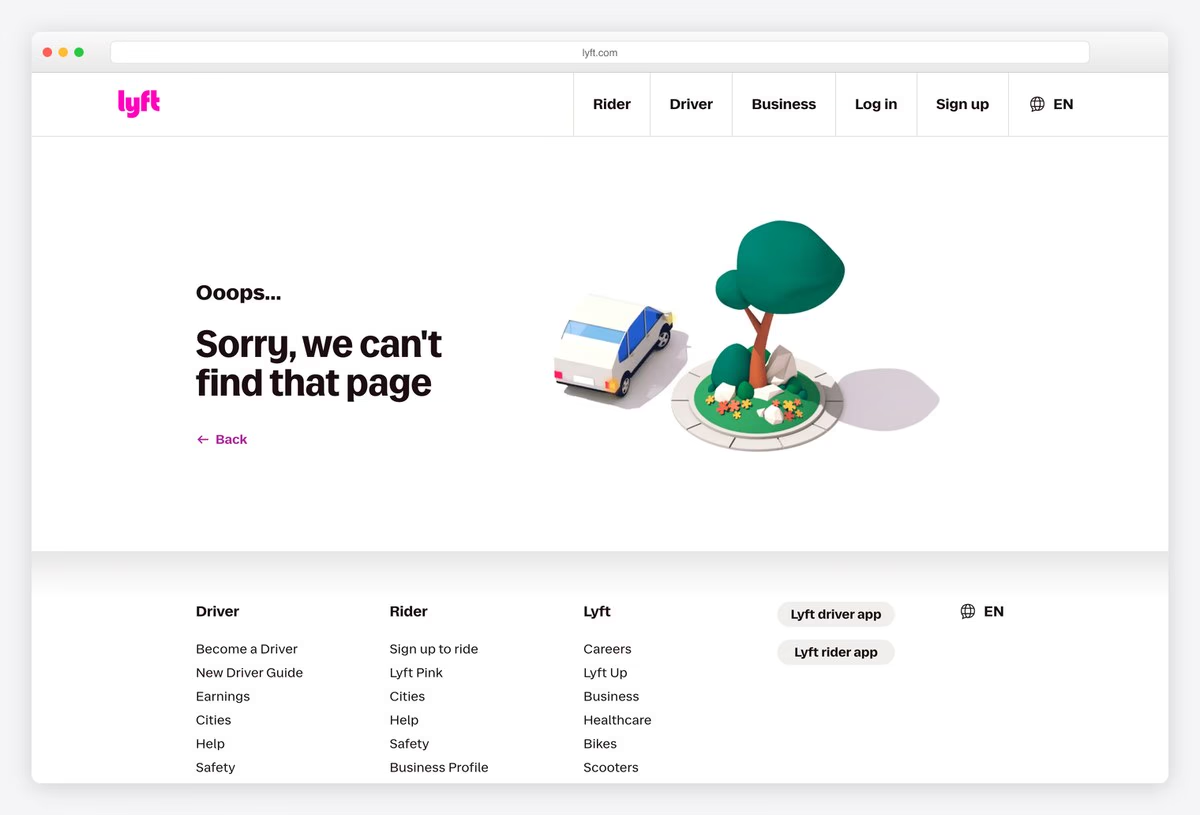
Lyft’s 404 shows a small 3D scene of a car parked by a tree on a floating island, next to “Ooops… Sorry, we can’t find that page”. The scene moves gently, one of only three pages on this list with real motion.
A Back link sits under the message, and the full footer of driver and rider links is close below, so the page works for both of Lyft’s audiences.
What stands out: A small 3D scene that gently moves.
Playful and On-Brand 404 Pages
Pages that turn a dead end into a small joke, a gift or a moment of calm, in the brand’s own voice.
11. Slack
Way back: Go back, or the Help Centre
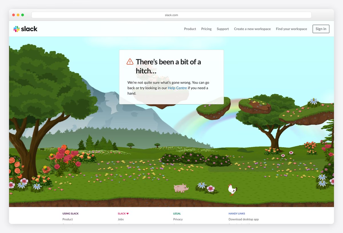
Slack’s 404 is a full-width illustrated landscape of hills, trees and flowers, with a white card in the sky that reads “There’s been a bit of a hitch…”
The message keeps Slack’s friendly voice and points to the Help Centre, and the scene fills the whole first screen, which makes the page feel like a place rather than an error.
What stands out: A whole illustrated landscape instead of an error message.
12. Dribbble
Way back: Shots in a colour you pick, plus search
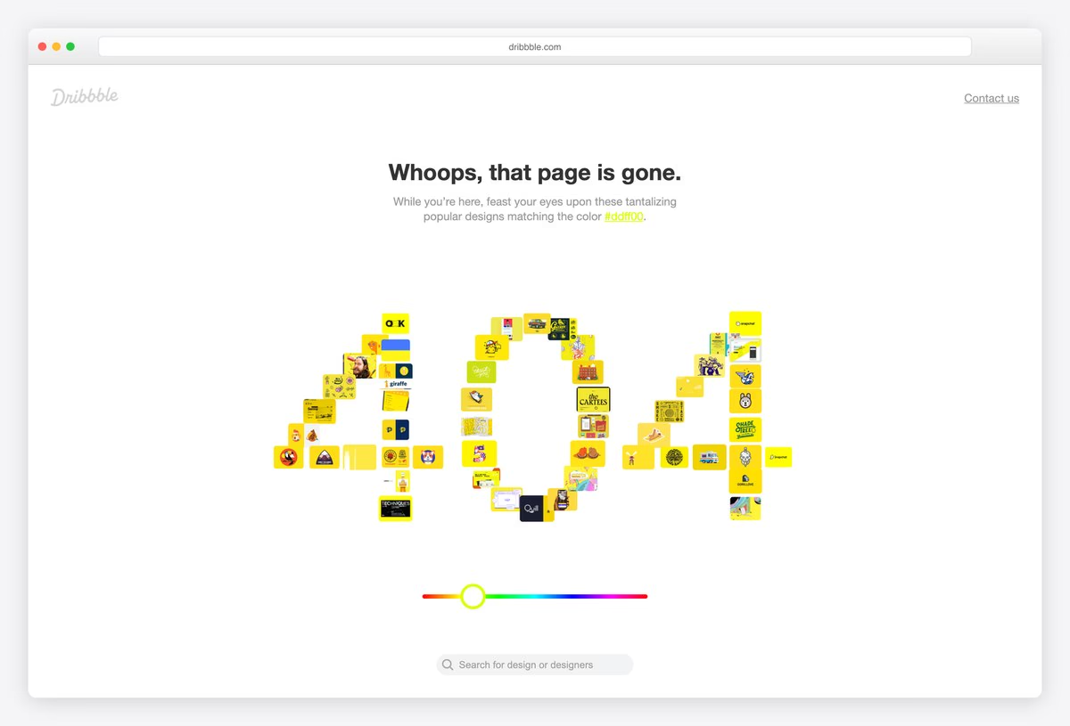
Dribbble’s 404 is made of its own content: the number 404 is built from a mosaic of small design shots in a single colour, with “Whoops, that page is gone.” above it.
A colour slider under the mosaic lets visitors pick another colour and see popular designs matching it, and a search field follows. It is the most interactive idea on this list: the error page becomes a way to browse the site.
What stands out: The 404 is built from the site’s own content.
13. Blizzard
Way back: One button back to safety
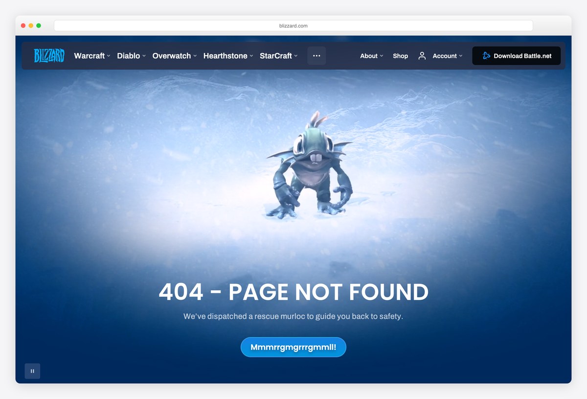
Blizzard’s 404 shows an animated murloc, a fish creature from World of Warcraft, in a deep blue underwater scene, with “404 – PAGE NOT FOUND” and the line “We’ve dispatched a rescue murloc to guide you back to safety.”
A single button labelled in murloc gibberish takes visitors home. Fans recognise the joke instantly, and the full Blizzard games menu stays at the top.
What stands out: A video and an in-joke for the game’s own fans.
14. Product Hunt
Way back: Go to the homepage button
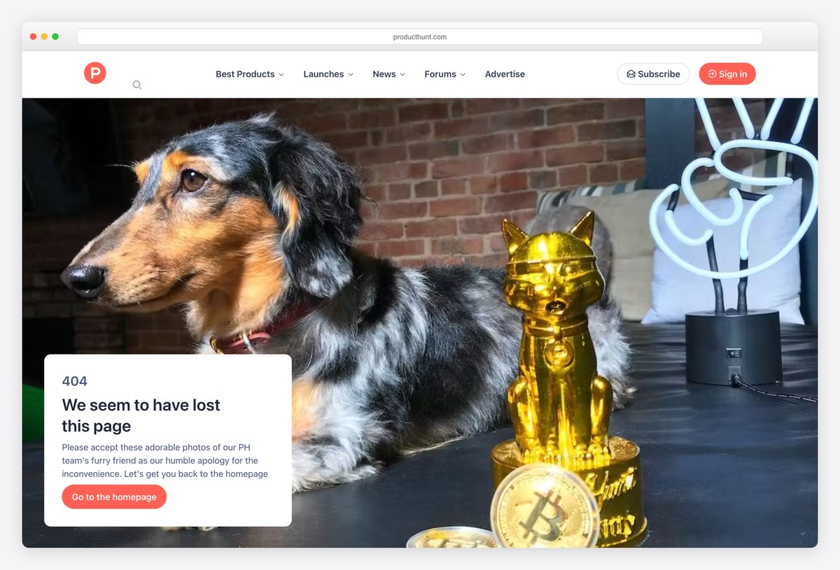
Product Hunt fills its 404 with a large photo of a dog beside a gold cat figurine, and a card that says “We seem to have lost this page”, followed by: “Please accept these adorable photos of our PH team’s furry friend as our humble apology”.
A Go to the homepage button sits in the card, and the page lists top product categories below, so it doubles as a way into the site.
What stands out: An apology made of pet photos.
15. Magnt
Way back: Navigation only; the joke is the page
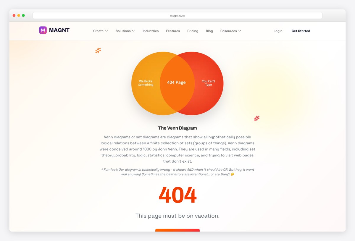
Magnt, a marketing platform, turns its 404 into a mini lesson: a Venn diagram with the overlap labelled 404 Page, under the heading The Venn Diagram and a short, deadpan explanation of what Venn diagrams are for, including trying to visit pages that don’t exist.
A fun fact admits the diagram is technically wrong. It is a clever example of humour that matches a data-minded audience.
What stands out: A deadpan joke for a data-minded audience.
16. Canva
Way back: Go to home link
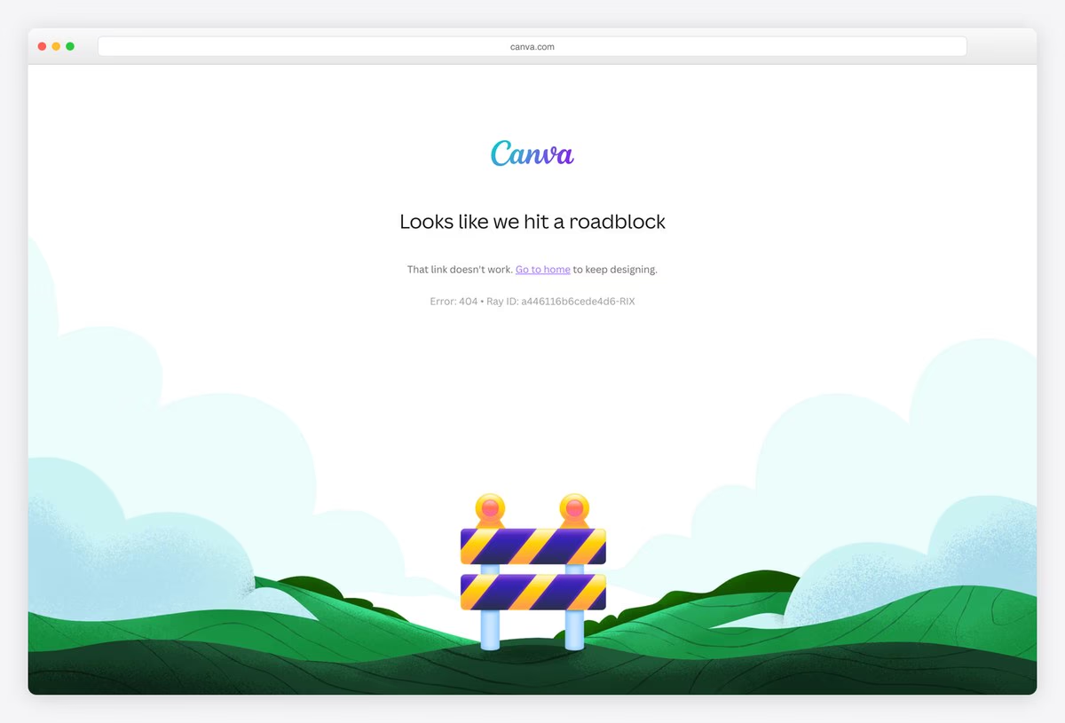
Canva’s 404 shows a road barrier on green hills under a soft blue sky, in the same friendly illustration style as the rest of the app, with the heading “Looks like we hit a roadblock”.
The copy is short and on-message (“Go to home to keep designing”), and the page shows the error code and request ID in small type for support.
What stands out: A friendly roadblock that keeps the user designing.
17. Headspace
Way back: Back to home, after a breathing prompt
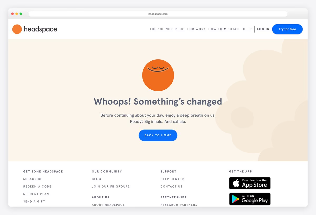
Headspace uses its 404 to do what the app does: under a smiling orange sun, the page says “Whoops! Something’s changed” and then “Before continuing about your day, enjoy a deep breath on us. Ready? Big inhale. And exhale.”
The background gently shifts, and a Back to home button follows the breathing prompt. It is the clearest example here of a 404 that delivers a tiny piece of the product.
What stands out: A 404 that gives the visitor a breathing exercise.
18. Kickstarter
Way back: Take a chance on a random project, or go home
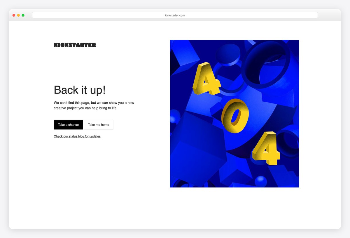
Kickstarter’s 404 says “Back it up!” beside a big 3D 404 in blue and yellow, and offers something no other page here does: a Take a chance button that opens a random creative project.
A Take me home button and a link to the status blog complete the page. Turning a dead end into discovery is exactly right for a site built on finding new projects.
What stands out: A dead end turned into a random discovery.
Big-Visual 404 Pages
Full-screen photography, artwork or type that makes the error page feel like part of the product.
19. Netflix
Way back: One Netflix Home button
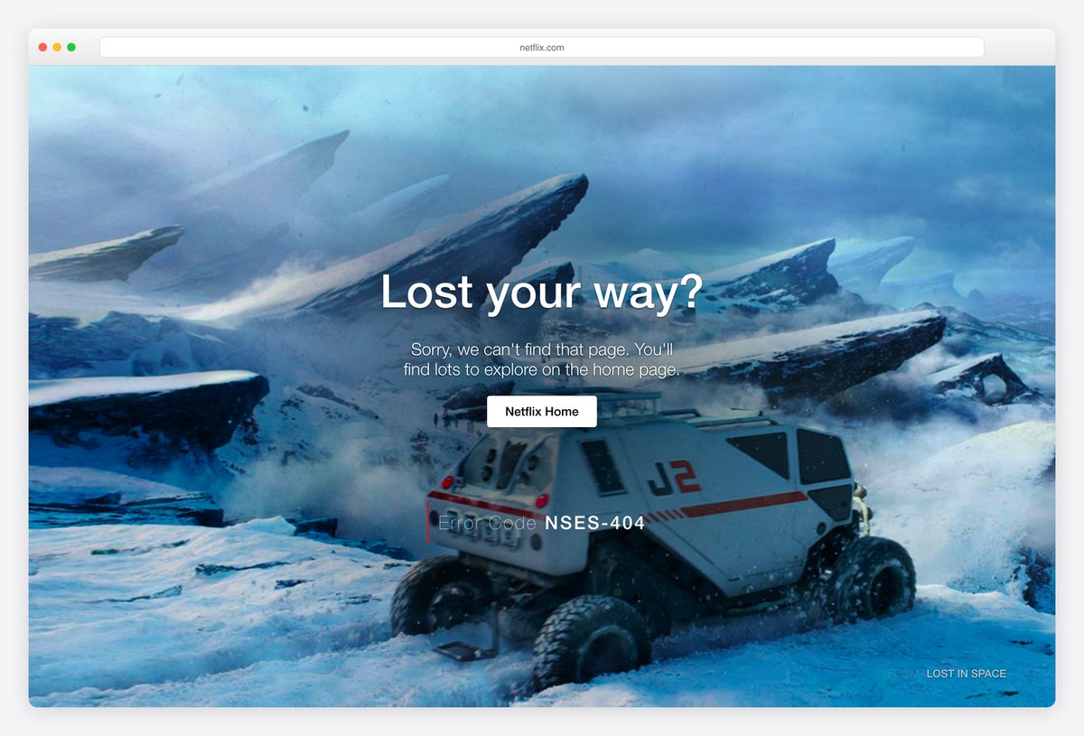
Netflix’s 404 fills the screen with a still from its series Lost in Space, a rover on an icy alien landscape, with the headline “Lost your way?” and a white Netflix Home button.
The page credits the show (FROM LOST IN SPACE) and shows an error code. One technical note: it returns HTTP 200 rather than 404, so search engines can treat it as a real page, the one thing to avoid copying.
What stands out: A cinematic still from its own catalogue.
20. NASA
Way back: Return Home, Sitemap and Contact NASA
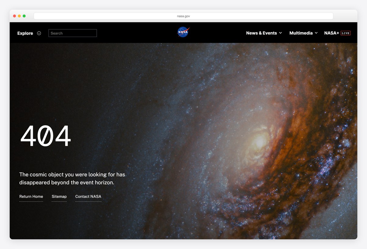
NASA’s 404 is a full-screen image of a spiral galaxy, with a large 404 and the line “The cosmic object you were looking for has disappeared beyond the event horizon.”
Three links (Return Home, Sitemap and Contact NASA) and the site search in the header give visitors a way back. It shows how a strong brand image and one good sentence are enough.
What stands out: One galaxy, one sentence, three exits.
21. Cloudflare
Way back: Take me home and View all products
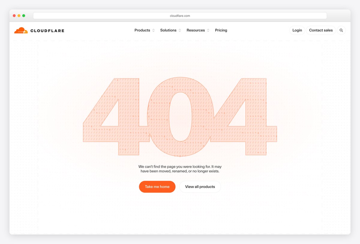
Cloudflare’s 404 sets a giant 404 in pale, textured orange type across the page, with a short explanation that the page may have been moved, renamed or deleted.
Two buttons follow, Take me home and View all products. The oversized type makes the page feel designed rather than default, without any illustration, and the page keeps the full Cloudflare navigation and footer for anyone who wants to browse instead.
What stands out: Oversized type does all the design work.
22. Figma
Way back: Full navigation and footer
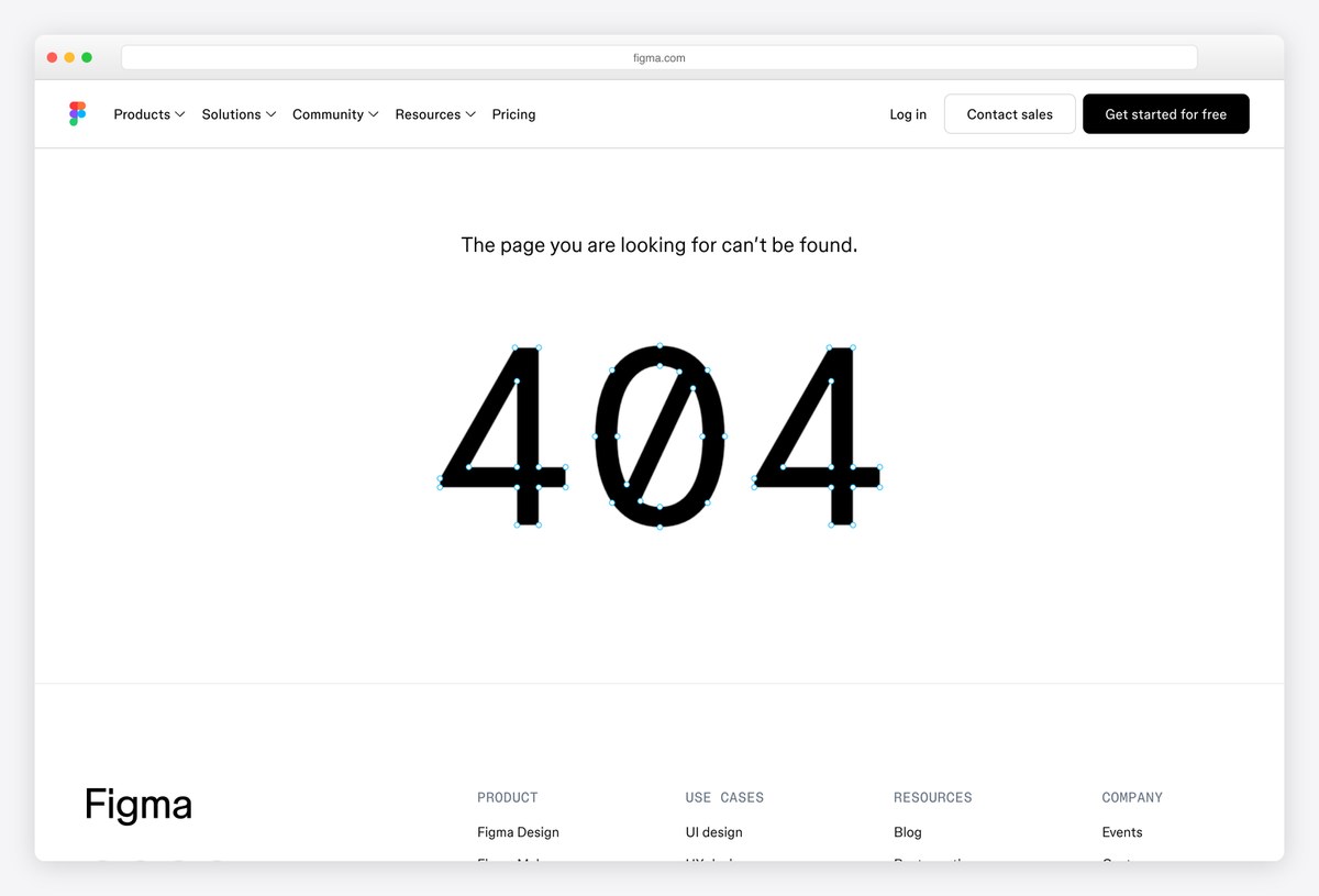
Figma’s 404 is pure typography: a single line, “The page you are looking for can’t be found.”, above an enormous 404 set in a monospaced face with a slashed zero, on a white page.
The full Figma navigation and footer stay in place for the way back. For a design tool, letting typography carry the page is a fitting choice.
What stands out: A slashed-zero 404 in a monospaced face.
23. Squarespace
Way back: Five suggested topics, from Templates to Marketing Tools
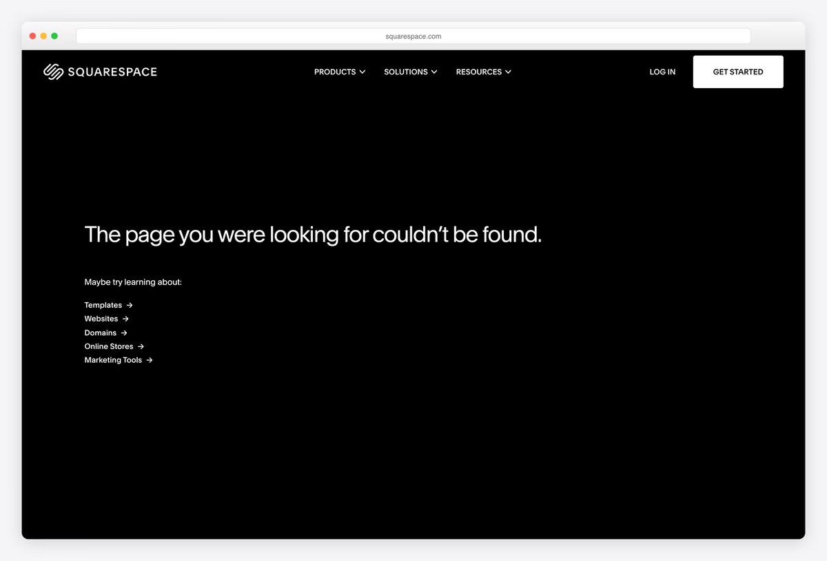
Squarespace’s 404 is all black, with its usual navigation and the line “The page you were looking for couldn’t be found.” set in its clean sans-serif.
Under it, a short Maybe try learning about list suggests five topics (Templates, Websites, Domains, Online Stores and Marketing Tools), each with an arrow. It looks exactly like the rest of the site, which is its own kind of polish.
What stands out: Suggested topics instead of a dead end.
Helpful and Minimal 404 Pages
Quiet pages built for one job: getting the visitor to the right place as fast as possible.
24. Google
Way back: None: a plain message
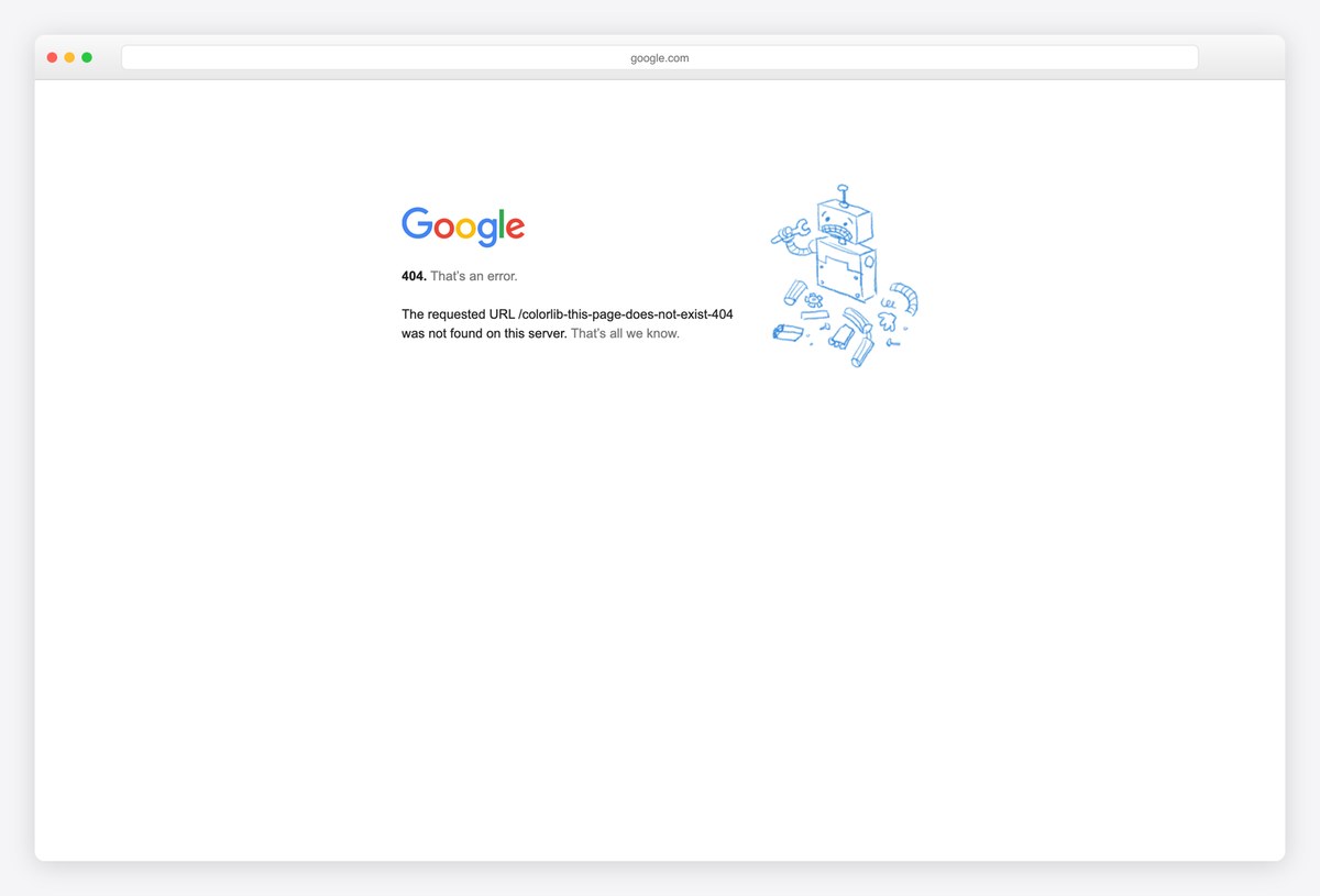
Google’s 404 is famously plain: the Google logo, “404. That’s an error.”, the exact URL that was requested and “That’s all we know.”, next to a small line drawing of a broken robot.
There is no search box or link, which is a lesson in itself: Google can get away with it because everyone knows how to get back to Google. Most sites cannot.
What stands out: The plainest famous 404, and a reminder most sites need more.
25. Apple
Way back: Search apple.com and the site map
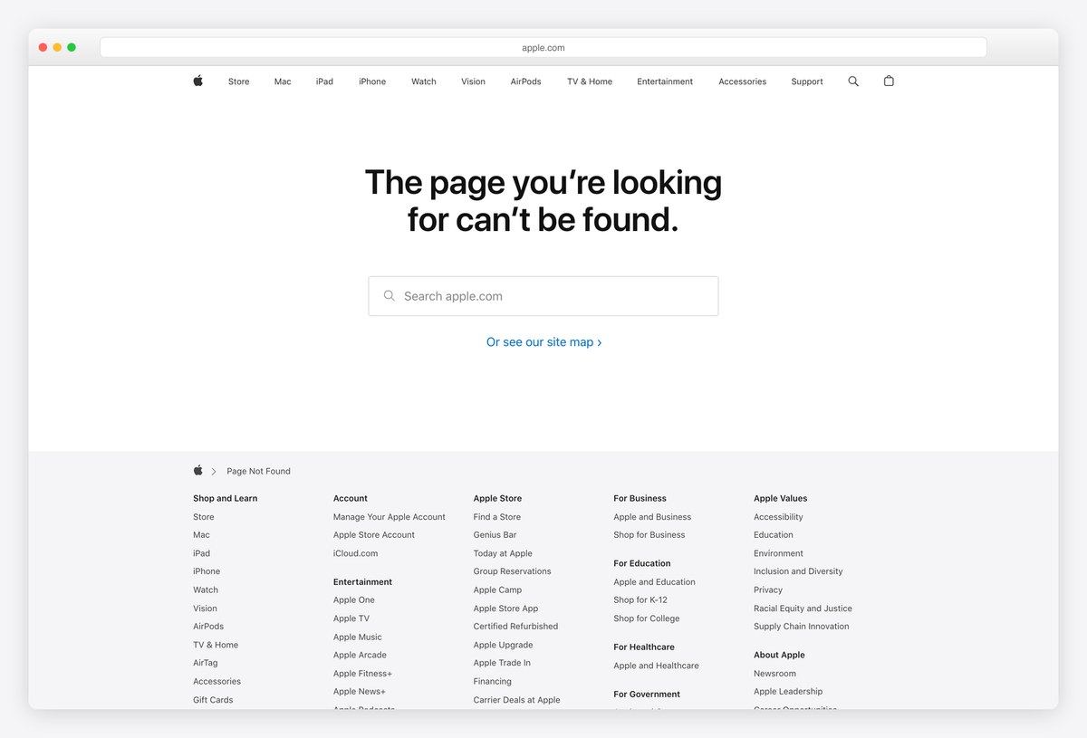
Apple’s 404 keeps the global navigation and centres a single line, “The page you’re looking for can’t be found.”, above a Search apple.com field and a link to the site map.
Below, the full Apple footer acts as a complete index of the site. Nothing is decorated, and that restraint is exactly Apple’s style. For a site this large, a search box and a complete map are more useful than any illustration.
What stands out: A search box and the site map, nothing else.
26. Stripe
Way back: Cards for pricing, docs, API, status and support
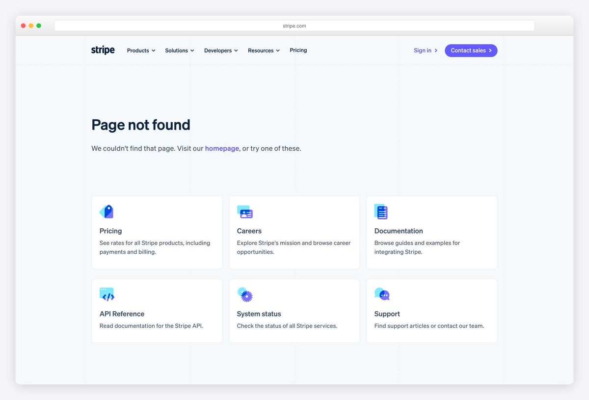
Stripe’s 404 is a short Page not found heading followed by a grid of cards, each with an icon and one line of description: Pricing, Careers, Documentation, API Reference, System status and Support.
It reads like the start of a help centre, which suits a developer audience: most people who hit a broken Stripe link want the docs or the status page.
What stands out: A grid of the six places visitors most likely meant.
27. NPR
Way back: Search, report the page as missing, or browse
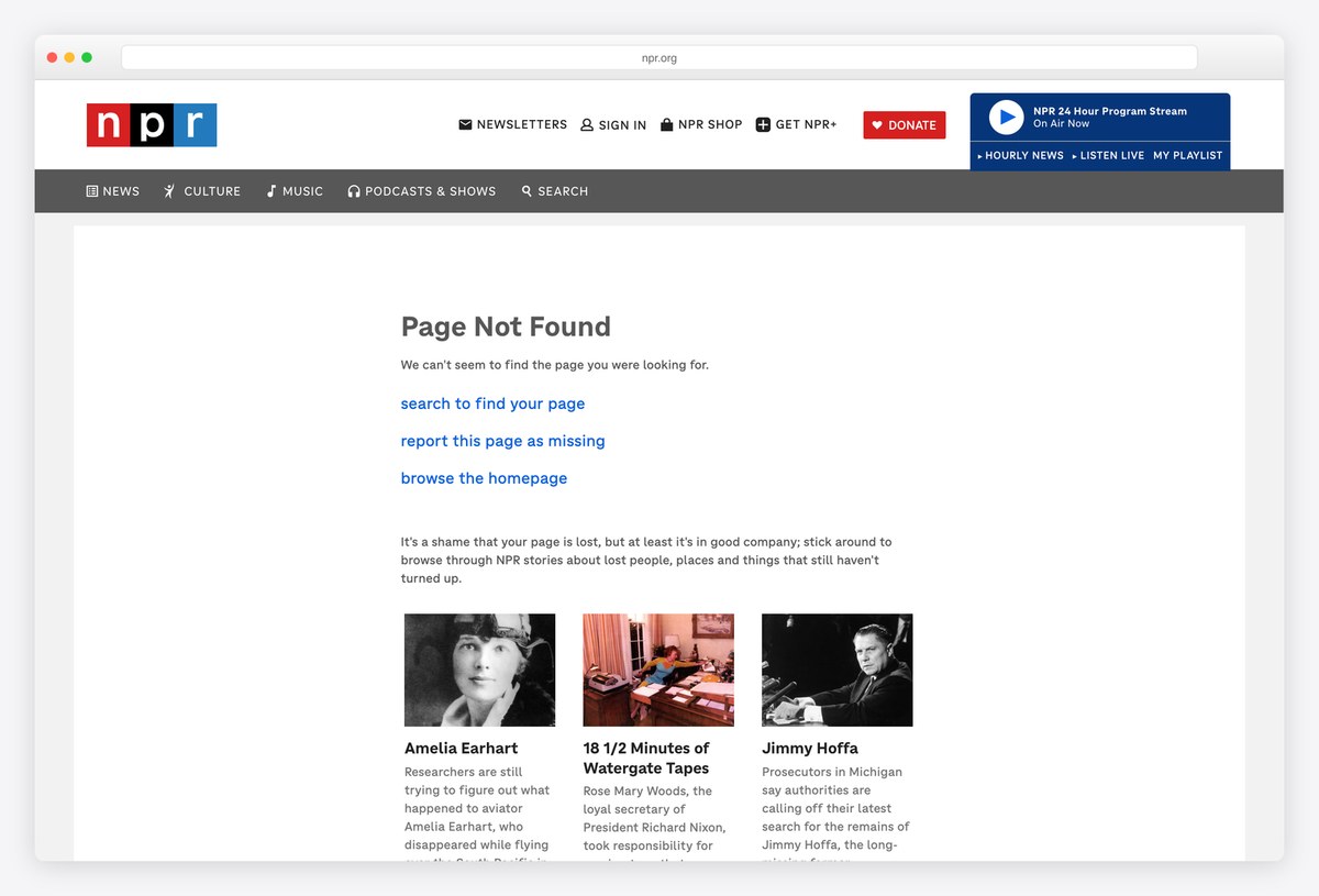
NPR’s 404 offers three clear actions (search to find your page, report this page as missing and browse the homepage) and then a joke that works because of its content.
“It’s a shame that your page is lost, but at least it’s in good company”: below, it lists NPR stories about lost people, places and things, such as Amelia Earhart. It is useful and on-brand at once.
What stands out: Stories about lost things, curated for the lost page.
28. Mozilla
Way back: Go Back plus three mission links
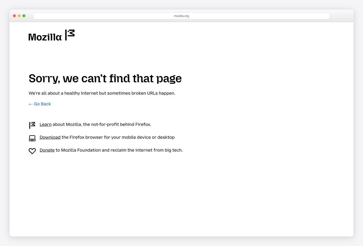
Mozilla’s 404 is short and in character: “Sorry, we can’t find that page”, followed by “We’re all about a healthy internet but sometimes broken URLs happen.”
A Go Back link and three icon links (learn about Mozilla, download Firefox and donate to the foundation) turn the error into a quick summary of what the organisation does.
What stands out: An error page that doubles as a mission statement.
29. BBC
Way back: Search box and BBC Homepage link
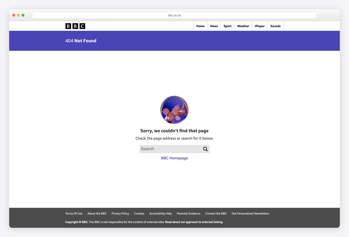
The BBC’s 404 keeps its standard header with News, Sport, Weather, iPlayer and Sounds, a purple banner reading 404 Not Found and a small round illustration above the message.
The fix is practical: check the address or search for the page in the box below, with a BBC Homepage link. For a site with millions of pages, search is the most useful thing a 404 can offer.
What stands out: Search first, for a site with millions of pages.
30. Mailchimp
Way back: Links to products, resources and stories
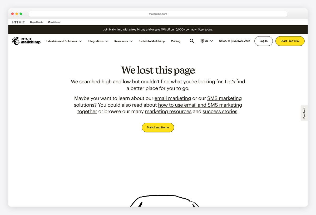
Mailchimp’s 404 sets the headline We lost this page in its serif type, followed by a longer paragraph that suggests where to go instead: email marketing, SMS marketing, guides and success stories.
A yellow Mailchimp Home button sits below. Writing the suggestions as a sentence rather than a list makes the page feel personal while still pointing to the main sections.
What stands out: Suggestions written as a friendly sentence.
31. Atlassian
Way back: Homepage, help and search
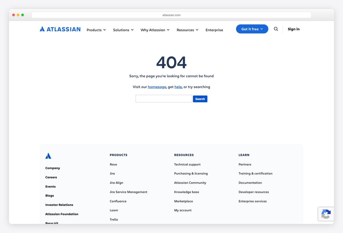
Atlassian’s 404 is a big blue 404 and one sentence, followed by Visit our homepage, get help, or try searching, with a search field right on the page.
The full product footer (Jira, Confluence, Loom, Trello, Bitbucket and more) sits below, which helps a visitor who came looking for one specific product. It is a sensible pattern for any company with a family of products under one domain.
What stands out: Homepage, help and search in one line.
How to Design a Good 404 Page
Say what happened in one line. “We can’t find this page” is enough. Bitly goes one step further and explains the likely cause (links are case sensitive), which is the most helpful sentence on any page here.
Offer a way forward. A search box (GitHub, Apple, BBC), a few likely destinations (Stripe’s cards, Airbnb’s list) or one clear button (Monzo, Netflix). Google’s page has none, and only Google can afford that.
Keep the site’s navigation. LEGO, Marvel and Apple keep the full header and footer, so a lost visitor can carry on without pressing back. A 404 that drops the navigation is a second dead end.
Use the brand’s own world. The best pages borrow something the audience already loves: Pixar’s characters, Blizzard’s murloc, Netflix’s Lost in Space still, GitHub’s Octocat. A generic illustration is fine; a familiar one is memorable.
Turn the dead end into discovery. Kickstarter’s Take a chance button, Dribbble’s colour-matched shots and NPR’s stories about lost things all give the visitor something better than what they were looking for.
Return a real 404 status. The page should send HTTP 404 (or 410 for content removed on purpose), not 200. A 200 response tells search engines the error page is real content, a soft 404. Of the pages here, only Netflix’s returns 200.
Keep it light and accessible. Error pages are often reached on slow connections or from broken links in emails. Use a real heading, alt text on the illustration, enough contrast and no heavy animation unless, like Blizzard’s, it is the whole joke.
Frequently Asked Questions
What should a 404 page include?
A 404 page should include a short, clear message that the page cannot be found, the site’s normal navigation, and at least one way forward: a search box, links to the most visited pages or a button back to the homepage. A friendly tone and a brand illustration help, but the way back matters most.
What are some good 404 page examples?
Well-known examples include LEGO’s “Oh bricks!” minifigure, Pixar’s Inside Out character, GitHub’s Octocat scene, Slack’s illustrated landscape, NASA’s galaxy, Netflix’s Lost in Space still and Kickstarter’s random-project button. Each one pairs a memorable visual with a clear way back to the site, which is why they are so often shared and cited as models.
Does a 404 page affect SEO?
A 404 page itself does not hurt rankings, as long as it returns a real 404 or 410 status code. Problems come from soft 404s, where the error page returns 200, and from broken internal links. Fix or redirect links to moved pages, and keep the 404 page for addresses that never existed.
Should a 404 page redirect to the homepage?
No. Automatically redirecting every missing page to the homepage confuses visitors and search engines, which may treat the redirects as soft 404s. Show a proper 404 page with a link to the homepage instead, and use 301 redirects only for pages that moved to a specific new address.
How do you make a custom 404 page?
Most platforms let you set one: WordPress themes use a 404.php template, static hosts like Netlify and Cloudflare Pages use a 404.html file, and frameworks such as Next.js have a not-found page. Design it like any other page, keep the site navigation and confirm it returns a 404 status.
Should a 404 page be funny?
Humour works when it matches the brand and does not get in the way. LEGO, Blizzard and Product Hunt use jokes their audiences enjoy, while banks, health and government sites usually keep it calm and practical. Whatever the tone, the way back to the site should be easy to find.
Wrapping Up
Want to build your own? Start from our free 404 error page templates, which you can adapt with the ideas above.
Browse the other Design styles & page types website examples (20 more collections), or see website examples for every industry.
Was this article helpful?
YesNo

