Website Navigation Menu Best Practices: 16 Design Tips

You know that feeling when you’re standing in line, phone in one hand, coffee in the other, trying to buy something before it’s your turn to order — but the confusing mobile menu, teeny-tiny links, and lack of a search bar on the retail site you’re looking at ends up driving you to *gasp* Amazon instead? That tiny rage-quit moment is exactly how your visitors feel when your navigation doesn’t help them find what they need.
On mobile, especially, people are multitasking. And with 57% of global e-commerce sales and 44% of U.S. ecommerce sales now happening on mobile, plus 75% of e-commerce traffic coming from mobile devices, a confusing menu costs you real money.
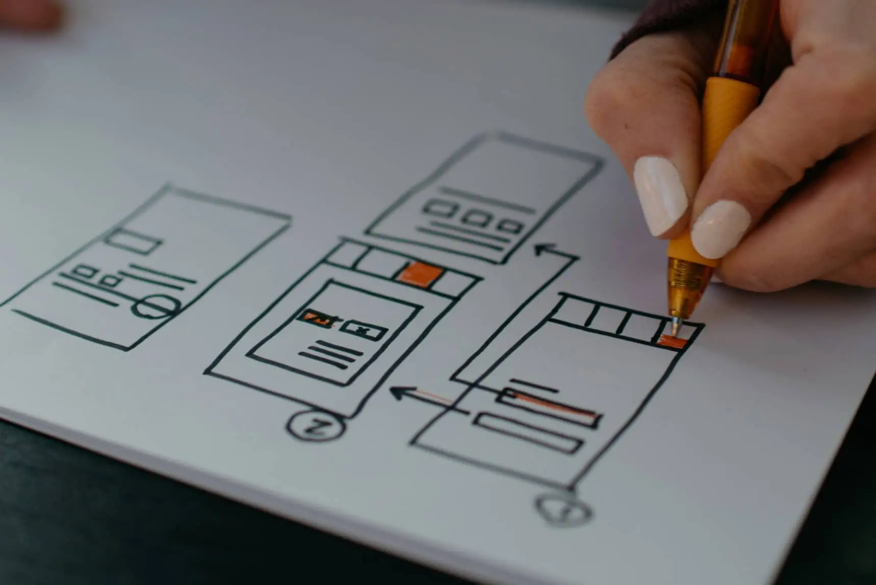
In this guide, we’ll break down what navigation menus are, why they matter for UX and conversions, and 16 practical design tips you can implement without hiring an agency. You’ll also see real examples from small businesses and a simple plan for measuring and improving your menu over time.
What Is a Website Navigation Menu (and How Does It Work)?
A website navigation menu is the set of links that helps visitors move between your most important pages, usually in your header, sidebar, or footer (or all of the above). It’s how people (and search engines) understand what your site offers and how your content fits together.
A primary navigation menu typically appears at the top of every page as a horizontal bar, or as a hamburger menu on small screens. It usually includes your most important pages: “Shop,” “Services,” “Pricing,” “About,” “Contact,” “Blog,” and so on.
For example, here are the menus we’re currently working with on the DreamHost website:

Secondary navigation might live in a sub-header or sidebar with links like “Log In,” “Help,” “Account,” “FAQ,” “Documentation,” or specific collections. Footer navigation often has less-frequently used but still important links, like “Returns,” “Privacy Policy,” “Careers,” “Press,” “Accessibility,” and deep content.
Navigation Menus at a Glance
Different parts of your site play different navigation roles, and understanding them helps you avoid clutter.
Why Does Your Navigation Menu Matter for UX, SEO, and Conversions?
Your navigation menu directly affects whether people stay, explore, and convert on your site. A clear menu improves user experience, helps search engines understand your structure, and signals professionalism from the first click.
Research on digital products consistently shows that better UX design leads to higher retention and conversion rates because people can complete tasks more easily.
Navigation also influences performance. Heavy menus loaded with JavaScript, animations, and large images slow down page loads. One recent analysis found that at around 4.2 seconds of load time, conversion rates fall below 1%, and 63% of visitors abandon the site. If your navigation is part of the slowdown, it’s actively costing you revenue.
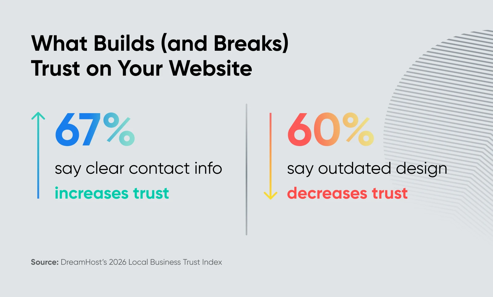
For small businesses, trust is the other big factor. DreamHost’s Local Business Trust Index data shows that 67% of people say clear contact info increases trust, and 60% say an outdated-looking site hurts their perception of quality. If your menu hides your contact page, or your layout feels dated, visitors may assume your business is, too.
Most small business websites use a combination of horizontal header menus, mobile hamburger menus, dropdowns or mega menus, sticky headers, and breadcrumbs. The right mix depends on how much content you have and what your visitors are trying to do.
Some common patterns you’ll see:
- Horizontal top navigation: A classic row of links across the top of the page.
- Vertical sidebar navigation: A column of links, usually on the left or right side, often used in blogs, apps, or dashboards.
- Hamburger/off-canvas navigation: Three stacked lines that open a slide-out menu, especially on mobile.
- Dropdown or mega menus: Menus that expand to reveal additional links when hovered or tapped.
- Sticky/fixed headers: Menus that stay pinned to the top of the screen while you scroll.
- Footer navigation: Links at the bottom of every page.
- Breadcrumbs: A horizontal trail that shows where you are in the site hierarchy.
The best navigation menus are readable, simple, consistent, audience-aware, accessible, and mobile-first, with just enough interactivity to feel polished without slowing down your site.
Below are 16 design tips to help you get there.
Tip 1: Make Your Navigation Menu Easy To Read
If people can’t read your menu at a glance, they won’t use it — so readability comes first.
To improve readability:
- Choose readable fonts: Use legible, web-safe fonts at a size large enough to read easily across devices. Avoid overly decorative or complex fonts.
- Deploy visual cues: Consider adding icons next to text labels to make menu items even easier to understand.
- Keep it simple and concise: Stay away from jargon or overly creative terms, and stick to commonly used words that users expect to see in a menu.
- Organize logically: Group similar items together in categories or submenus, and use an intuitive hierarchy to guide users through the menu items.
- Make it visually distinct: Use contrasting colors for the menu text and background to ensure readability. Consider separators or whitespace to visually distinguish groups of menu items, and implement a design feature that highlights the active page or menu item a user is hovering over.
Tip 2: Design Your Menu Around a Simple User Journey
Your navigation should reflect your visitors’ top tasks.
Consider whether all pages need to be accessible through the menu. What if only the first two (or maybe three) levels of pages were shown in the menu — with deeper pages available in other ways, such as via search, on-page links, or footer menus?
Start with what people come to your site to do:
- For a local service business: Pages that let visitors see services, check pricing, confirm location/hours, contact, or book.
- For an e-commerce shop: Pages where visitors can browse products, see collections, learn about shipping/returns, and log into their account.
- For a SaaS startup: Pages that help visitors understand what you do, see pricing, read case studies, or start a trial.
Map those tasks to clear top-level links, then make sure every important action is reachable in just a few clicks using your nav, search, or on-page links.
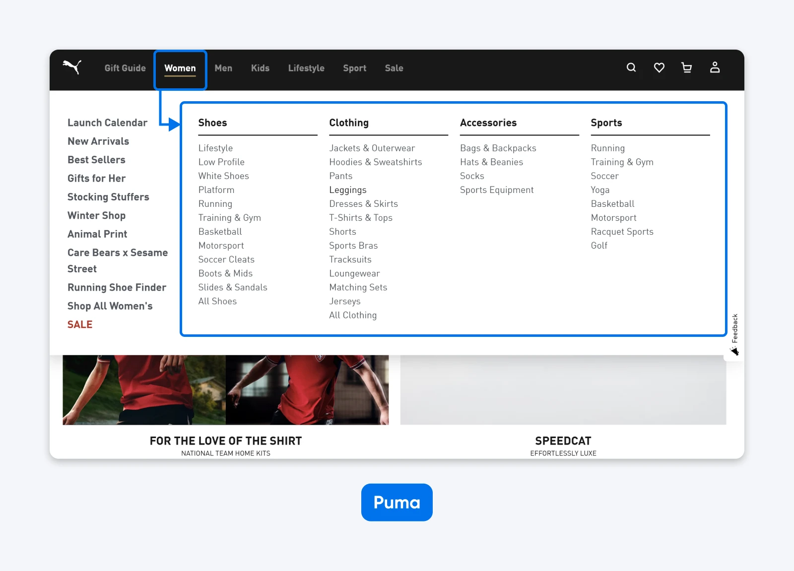
💡Pro tip: A general rule of thumb is that in three clicks or less, people should be able to land where they want to be on your site. That’s why sites like Puma, with a lot of content, often choose mega menus:
Keep in mind that the three-click rule is a guideline, not a law, but the spirit is right.
Tip 3: Keep Your Menu Visually Simple and Performance-Aware
Simple menus load faster, feel calmer, and make your site more usable on every device.
Overloading your navigation with heavy images, complex animations, or multiple layers of hover effects increases page weight and can drag your Core Web Vitals down.
Stick with lightweight micro-interactions (like subtle color changes or slide transitions) powered by CSS when possible. This keeps your nav feeling responsive while avoiding the overhead of large JavaScript libraries.
Tip 4: Tailor Your Navigation To Your Audience
The right navigation for a news site may not be the right navigation for a bakery, and yes, your visitors can tell.
So, design your navigation based on what you know about your existing and target audiences. With this in mind, you can choose color schemes, typefaces, and structures that are more likely to appeal to your market. This can make your navigation way more usable.
Ask yourself:
- Are most visitors new or returning? New visitors need simple labels like “Menu,” “Services,” “Pricing,” more than clever branded phrases.
- Are people on the go or likely to have time to explore? Mobile-heavy audiences need fewer options and bigger tap targets.
- Do they speak in industry terms or plain language? Match the vocabulary they use in your contact form, emails, and search queries.
Tip 5: Be Consistent
Consistency builds trust because visitors always know where they are and how to move around.
Basic consistency rules:
- Keep your menu in the same place on every page.
- Use the same styles and behaviors for dropdowns everywhere.
- Ensure your logo always links to your homepage, not a signup or promotion page.
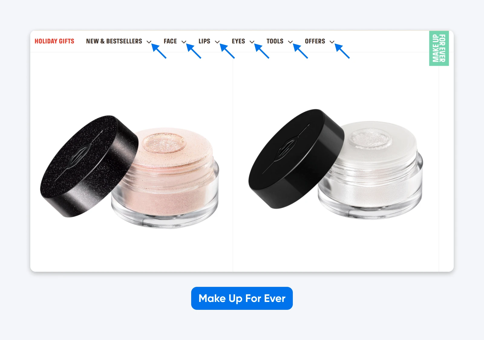
Here’s an example from Make Up For Ever. Look at how it uses directional arrows consistently — they always appear beside menu items that can expand into dropdown menus:
When you introduce new sections or experiment with new pages, maintain your core navigation structure. Small changes in copy or ordering are fine; wholesale layout changes from page to page are not.
Tip 6: Group and Organize Content With a Clear Hierarchy
Organized navigation helps visitors understand your catalog and find what matters without cognitive overload.
For example, many retail sites group products by categories right in the main navigation menu:
Here’s what to do:
Tip 7: Keep Navigation Simple
Even websites with an extensive network of pages don’t have to have levels upon levels of navigation.
Before you add fourth- and fifth-level dropdowns, ask:
- Can deeper pages be discovered via search, on-page links, or filtered collections?
- Can you surface only two or three levels of content in the main menu and let visitors drill down from there?
- Can certain content live in the footer navigation instead of the main header?
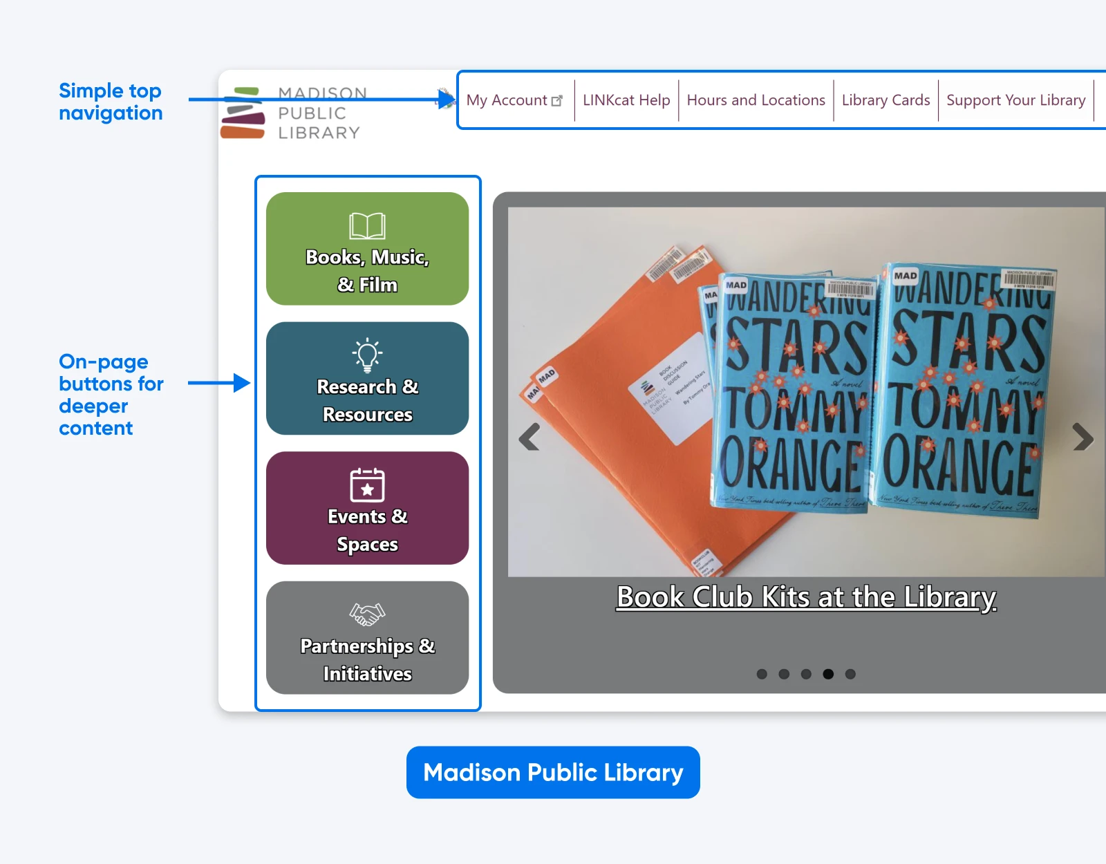
For example, a local library homepage may show essential links in a streamlined top navigation (hours, account access, search), with broader content categories accessible through clear visual buttons on the page itself — keeping the header focused while ensuring visitors can still explore everything the library offers.
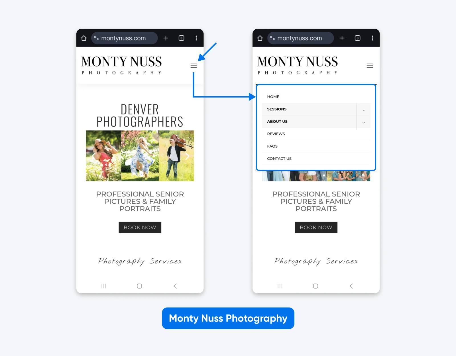
Tip 8: Design Navigation for Mobile and Other Devices
Designing just for desktop in 2026 is like designing a store that only works if people crawl in on their hands and knees.
We know mobile isn’t a side-channel anymore: nearly 100% of consumers have made at least one purchase via a mobile device, and a third of them make up to 40% of all their purchases on mobile.
To design better mobile and multi-device navigation:
- Use a hamburger or clearly labeled “Menu” button that expands into a full-screen or side drawer nav.
- Make tap targets at least 48×48 pixels and spaced apart to avoid accidental taps.
- Show only your top 3–5 actions at first, and place less critical links behind accordions or submenus.
- Consider how your navigation behaves on tablets, small laptops, and foldables, not just smartphones.
Tip 9: Use Familiar Web Conventions
How do you expect a website to behave? Those expectations are guided by web conventions — practices website builders use so often that they become the “standard.”
Some conventions are so widespread they’re basically non-negotiable:
- Clicking the logo goes to the homepage.
- A cart icon leads to the shopping cart or checkout.
- A magnifying glass icon opens search.
If you break these patterns — say, sending logo clicks to a sales page — you’re asking visitors to relearn the basics of your site. That’s a fast track to confusion and a higher bounce rate.
Tip 10: Write Clear, SEO-Friendly Menu Labels
Good navigation labels are descriptive, human-friendly, and lightly optimized for search.
To write better labels:
- Focus on topics, not formats like “Wedding Cakes” beats “Gallery”; and “Tax Planning Services” beats “Resources.”
- Use the words your audience actually searches for, based on your keyword research.
- Avoid internal jargon, acronyms, or overly clever names unless they’re widely recognized.
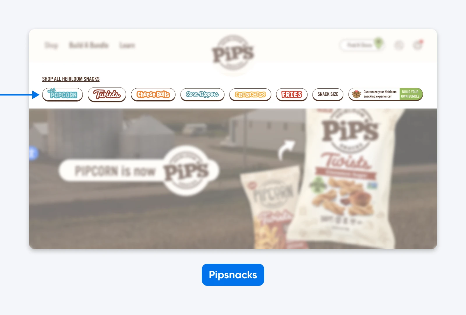
For example, Sweetwater’s navigation uses search-friendly labels like “Used Gear” and “Rentals,” terms customers actually type into Google, rather than vague categories like “Inventory” or “Services.”
In addition, there are lots more strategies you can try when structuring your website and navigation to boost SEO.
👉Learn more about how to structure URLs and hierarchy and on-page vs. off-page SEO.
Tip 11: Make Your Navigation Accessible
Accessible navigation isn’t just the right thing to do —it also opens your site to a huge portion of your potential audience. The World Health Organization (WHO) estimates that 1.3 billion people (about 16% of the global population) experience significant disability. In the U.S., recent CDC data shows that more than one in four adults has some type of disability. Yet a 2024 analysis found that only about 3% of the web is considered accessible.
To improve accessibility in your navigation:
- Provide thoughtful navigation: Organize menus logically, use consistent layouts, and add skip-to-content links for quick access.
- Make content clear: Use simple language, short sentences, and a straightforward layout to accommodate a wider range of cognitive abilities.
- Allow keyboard navigation: Ensure your menu is fully keyboard navigable, with visible focus states.
- Increase readability: Use high-contrast colors and scalable fonts, and provide volume controls for multimedia content.
- Use text alternatives: Include alt text for images, captions for videos, and transcripts for audio content so users with visual or hearing impairments can access the information.
- Avoid blinking or flashing content: Reduce the risk of triggering seizures by avoiding content that flashes more than three times per second.
Tip 12: Account for Real-World Reading Patterns
People don’t read web pages top-to-bottom: they scan, and the F-shaped reading pattern is one of the most common ways readers scan blocks of content.
Eye-tracking research shows that users:
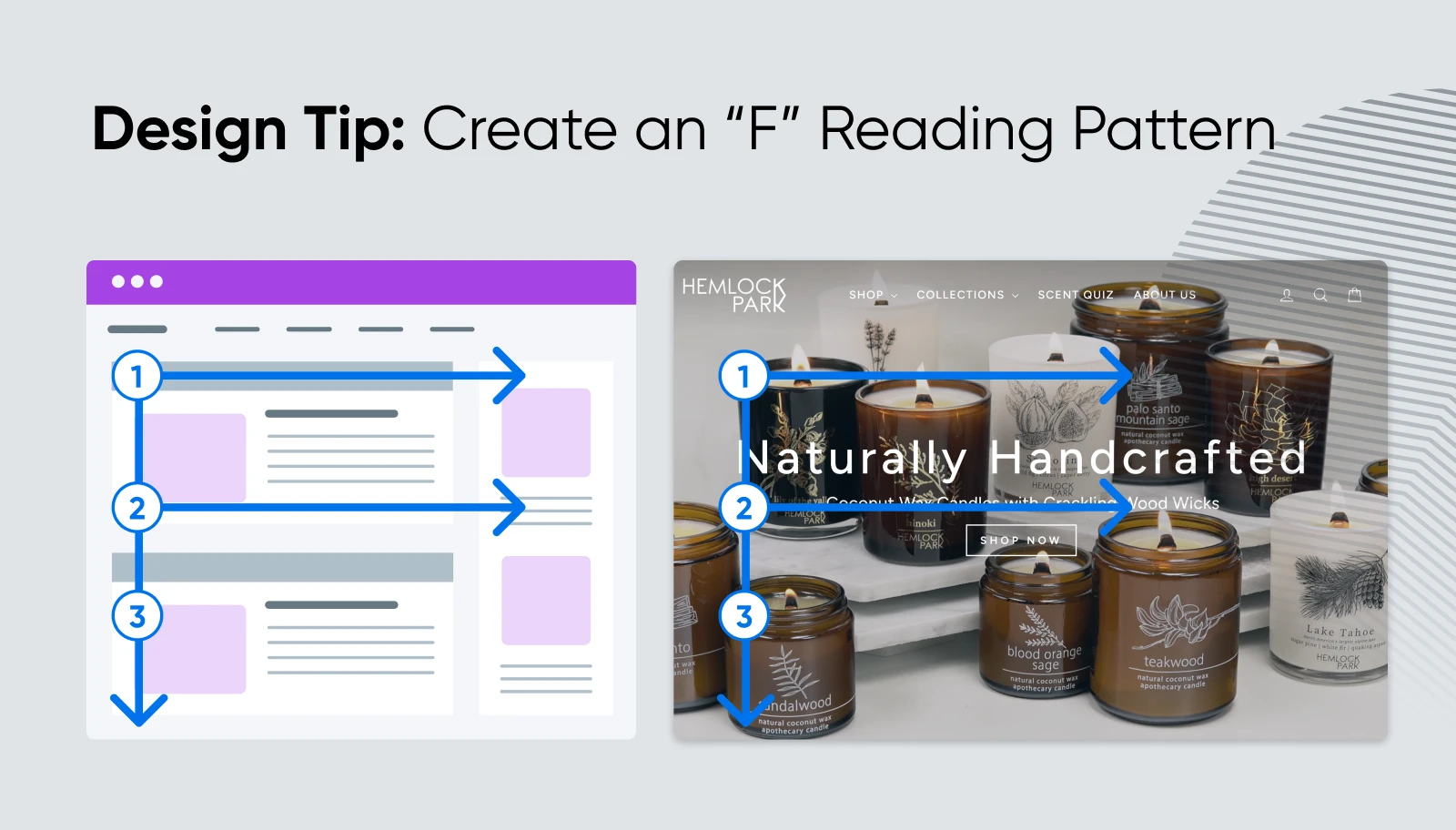
That’s why you should place your most important items toward the left of a horizontal menu or the top of a vertical menu. Don’t bury your “Shop” or “Book Now” link on the far right or deep in a dropdown if it’s a primary action.
Tip 13: Add Breadcrumbs
Not everyone is going to enter your site from the same point. Breadcrumbs enable users to see where they are within your site’s structure, no matter how they got there. They act like a trail of crumbs back to your site’s higher-level pages, helping users and search engines understand where they are.
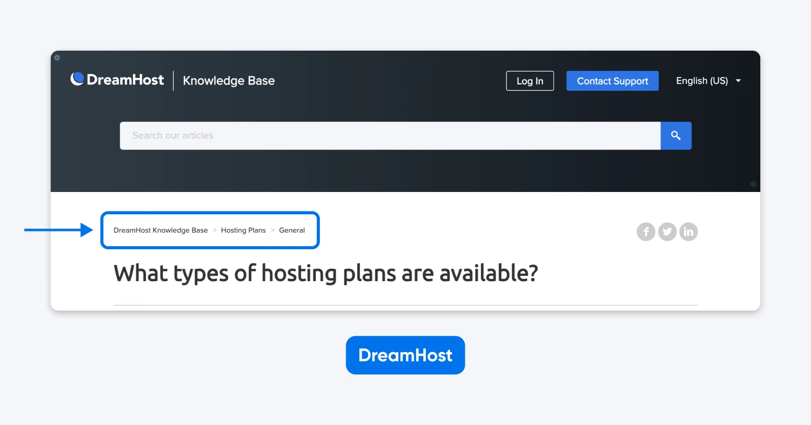
Breadcrumbs:
- Help visitors orient themselves on deep pages.
- Give them quick ways to jump up a level without hunting through menus.
- Provide extra internal links that can appear in search snippets, which can subtly support SEO.
They’re especially useful for e-commerce stores and content-heavy blogs with many nested categories.
Tip 14: Use Sticky Menus For Longer Pages
Fixed menus, AKA sticky menus, stay visible at the top of the page even while scrolling. They’re ideal when long pages would otherwise force users to scroll all the way back up just to change sections.
They work well when:
- You have long-scrolling landing pages for products or services.
- Your audience is primarily on mobile, where getting back to the top is extra annoying.
- You want visitors to always have access to key CTAs like “Book Now” or “Add to Cart.”
Tip 15: Let Search and Navigation Work Together
Navigation menus and site search are partners, not rivals, especially on large or fast-changing sites.
Search is especially vital when:
- You have a big product catalog or extensive content library.
- You see visitors repeatedly looking for specific items or article topics.
- People often arrive deep in your site from Google and want a quick way to find related content.
The best pattern for most small businesses is to keep a prominent search icon or field in the header, next to or inside the navigation.
Tip 16: Use Micro-Interactions To Help Users Feel In Control
Micro-interaction — those tiny visual responses when someone hovers, focuses, or clicks — reassure visitors that your menu is working and responsive.
Try these:
- A hover or focus state that changes link color or background.
- A subtle arrow rotation to show a submenu has opened or closed.
- A highlighted active state that shows which page someone is on.
💡Pro tip: Keep these effects quick and lightweight so they don’t slow down your site.
You don’t need enterprise-level resources to build excellent navigation; many small brands use simple, thoughtful menus that punch way above their weight. Here are a few examples you can learn and borrow from.
Mostly Serious Blends Creativity With Usability
Mostly Serious is a creative agency with a fittingly creative website. When you first land on the page, your attention is drawn to a large hero section paired with a minimal navigation treatment. A hamburger menu sits in the top corner, while the page itself focuses on a bold visual moment rather than a traditional menu bar.
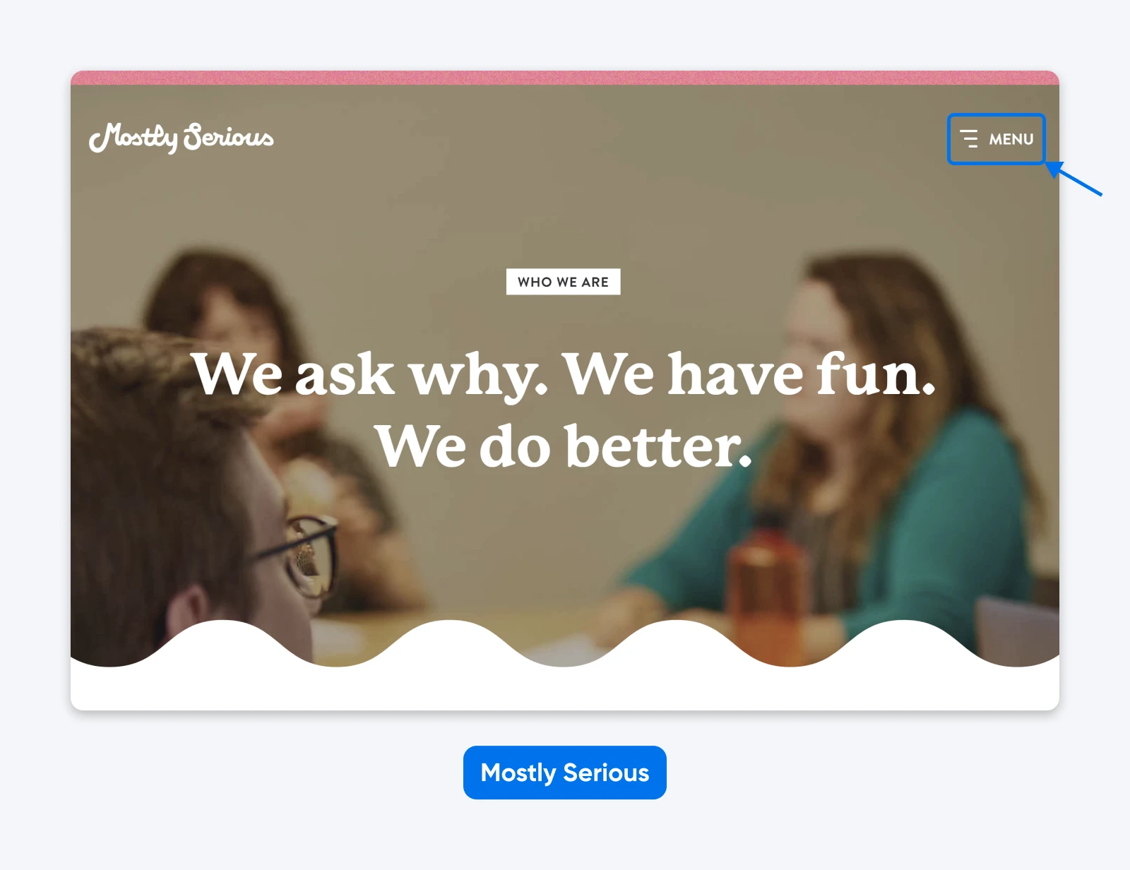
If you click the hamburger icon, it opens into a large-format, vertical menu that displays only the primary navigation items in oversized type. The effect is simple, legible, and deliberate — it removes visual clutter while still making the site’s structure immediately clear.
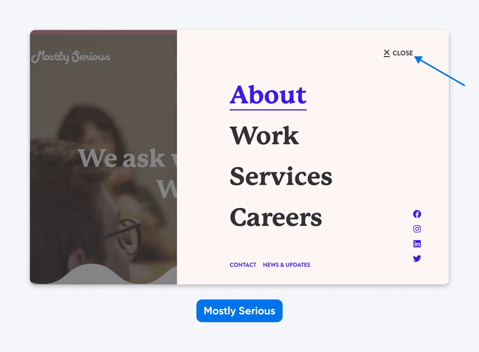
However, if instead you begin scrolling down the page, a sticky horizontal navigation appears at the top of the screen. This more familiar menu stays accessible as you move through the content, which introduces the team, services, and offerings in a straightforward, readable layout.
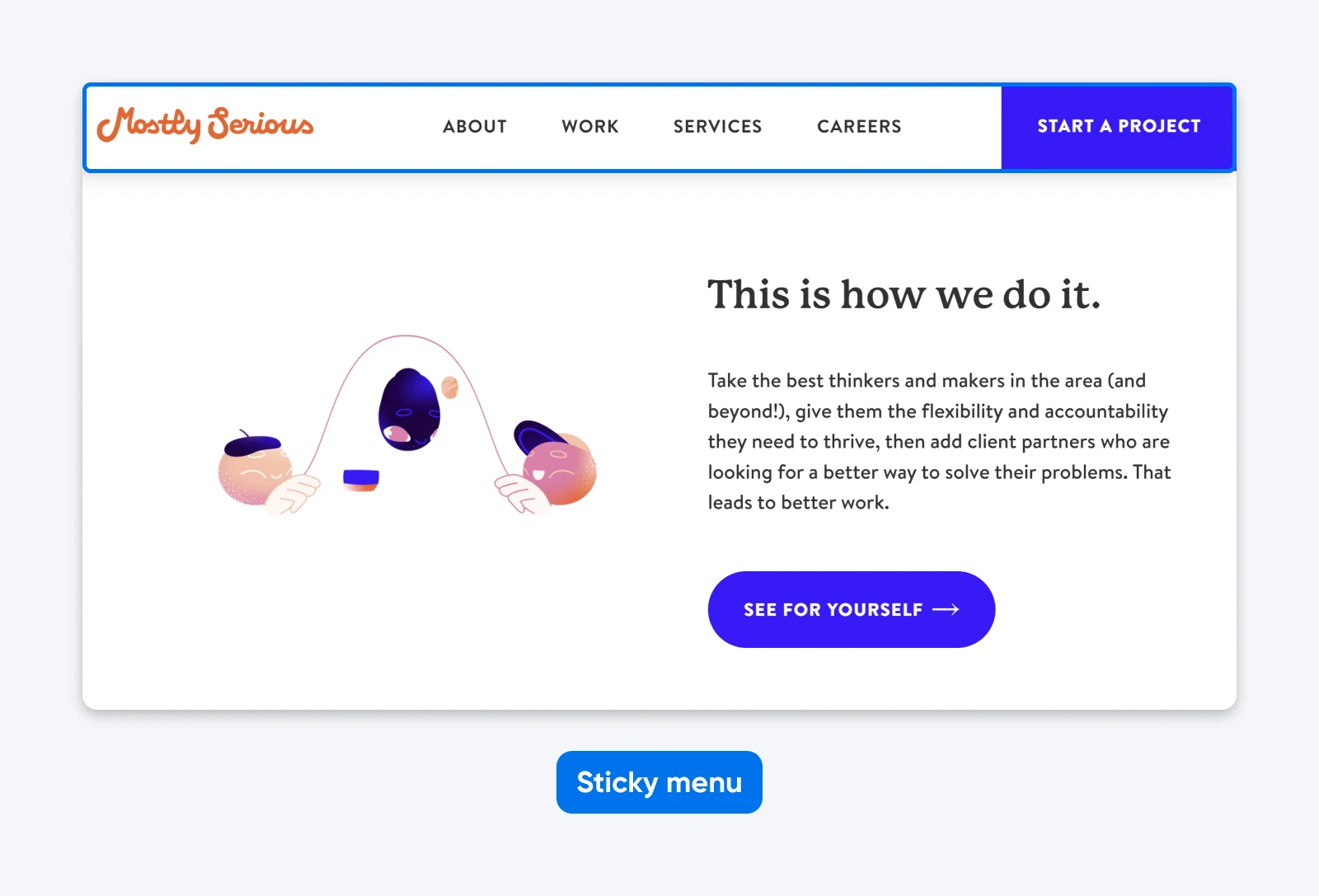
By offering different navigation treatments depending on how visitors choose to engage — clicking to explore or scrolling to read — Mostly Serious balances creativity with usability. It’s a smart example of how a brand can experiment with layout and interaction without sacrificing clarity or user comfort.
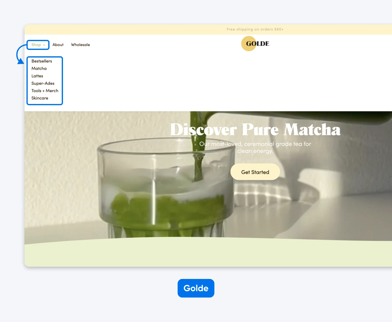
Golde Knows That Less Can Be More
Golde is a superfood brand with a menu that’s as simple, and therefore powerful, as the ingredients in the products they carry.
It’s immediately easy to see and laid out in the order in which they want customers to engage. Only one item in the menu — “Shop” — features a dropdown to dive deeper into the site. This is a call-to-action (CTA) of sorts that immediately funnels visitors to the product pages where they can complete their purchases.
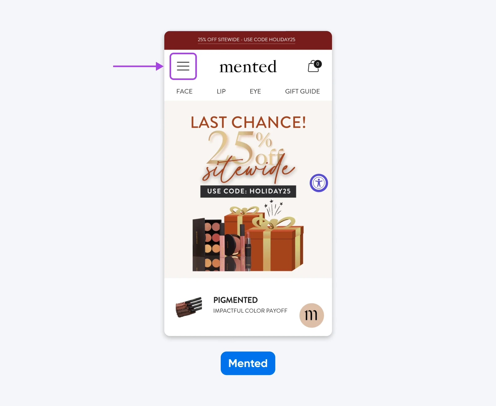
Mented Gets Mobile Navigation Right
The cosmetics brand Mented gets everything right on their menu for mobile devices (shown here on iPhone).
Compared to the desktop version, the mobile version of the website features a stripped-down menu that features exactly what they want shoppers to focus on. It’s easy to see and use, encouraging visitors to dive right into engaging with the site.
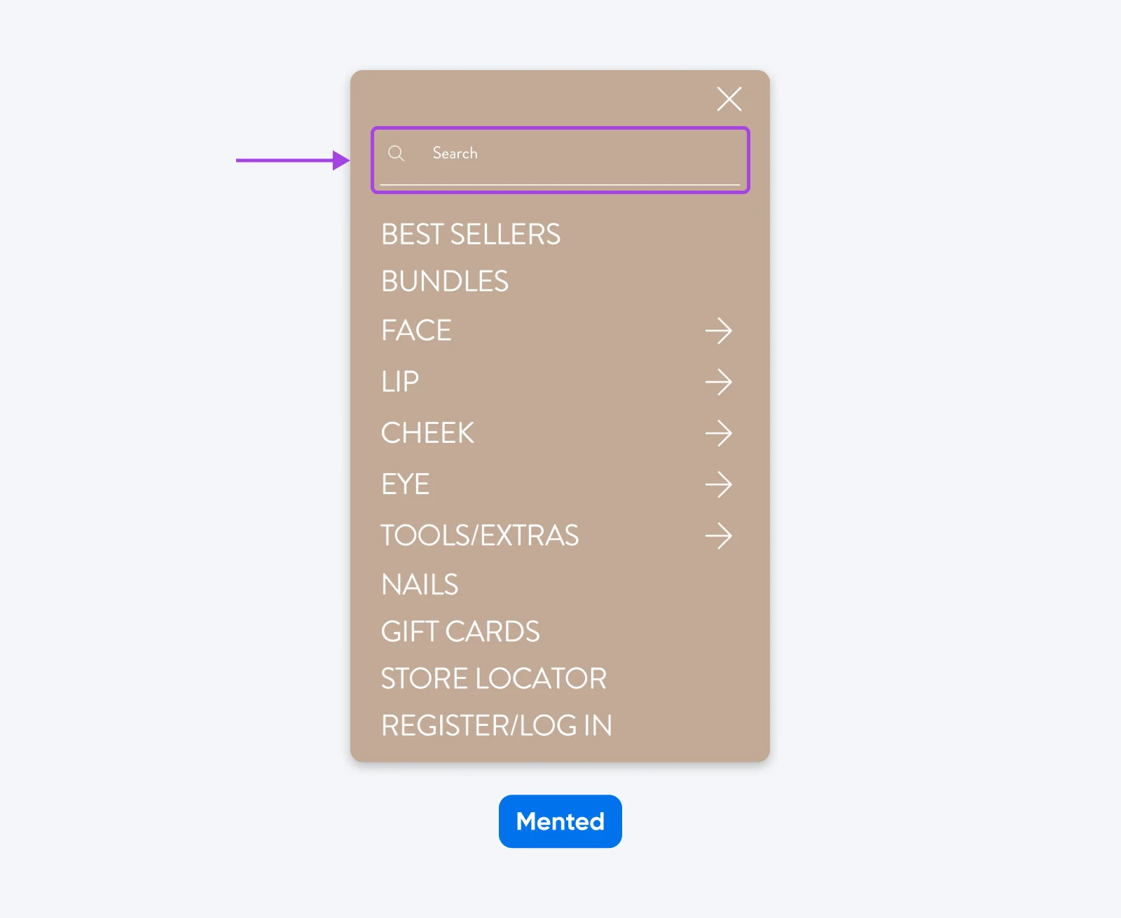
Clicking on the hamburger icon to the left of the site logo pulls up the rest of the menu, as well as a very obvious search bar.
This makes it exceedingly easy for visitors to quickly navigate to the product they’re looking for, therefore, very likely boosting conversions for their business.
You should revisit your navigation whenever your site changes significantly, your metrics or feedback show that people are getting lost, or your design starts to feel dated.
For most small businesses, that means looking at your navigation at least once a year, and any time you:
- Launch new product lines, services, or locations.
- Add a lot more content, like blog posts, guides, or resources.
- Go through a major rebrand or visual refresh.
Navigation issues also show up in your analytics and inbox. If you see frequent support questions like “Where do I find your menu?” or high exit rates on certain pages, something about your navigation might be confusing visitors.
Common Symptoms and Fixes
A quick way to diagnose navigation problems is to look for patterns in behavior and feedback, then map them to fixes.
How Can You Measure and Improve Your Navigation Menu Over Time?
Improve navigation by measuring what’s happening now, making small, focused changes, and repeating that process regularly.
How Do Core Web Vitals and Performance Tools Reveal Nav Issues?
Performance tools show you whether your navigation is helping or hurting your site speed and stability.
Core Web Vitals are a handful of metrics Google measures to grade your website’s performance. They evaluate the user-friendliness of your site, including your navigation menu, with a focus on speed, responsiveness, and visual stability.
There are a few ways to access and track your vitals so you can ensure maximum usability:
- Online tools: Pingdom, GTmetrix, and probably the simplest, Google PageSpeed Insights, can all help you access a Core Web Vitals report.
- Chrome UX Report: Available through Google Search Console, this report offers real-world data from your visitors, providing valuable insights into how users interact with your site and highlighting areas for improvement.
- Chrome Web Vitals Chrome extension: If you use Chrome, the Web Vitals extension makes it easy to assess Core Web Vitals for any site you visit.
How Can A/B Tests Help You Refine Navigation?
A/B testing is a powerful way to refine pretty much any element of your website by relying on real performance data.
Start by selecting an element to test, such as one of the labels in your navigation, or how you structure it.
Then, create two versions (A and B) with just one variable changed between them. Display both versions simultaneously to audiences of similar size and composition. Once the test concludes, compare the results to identify and implement the version that performs better.
How Does Attribution Reporting Show Which Menu Items Drive Results?
Attribution reports, sometimes called lead attribution reports, reveal how interactions on your website directly contribute to converting visitors into leads. They enable brands to understand exactly what content, menu items, and other features are most effective, so you can make data-driven decisions to optimize your navigation and other site elements.
Several marketing platforms offer a version of attribution reporting, including Wicked Reports, HubSpot, and LeadGenius.
How Can GA4 Path Exploration Uncover Navigation Friction?
Path exploration in GA4 helps you see where visitors go after they hit your homepage, and where they get stuck.
Acquisition reporting in Google Analytics 4 (GA4) provides valuable insights into the sources of your website traffic. Additionally, the path exploration report then visualizes the rest of the user journey through your site.
Together, these reports can tell the story of how potential customers interact with your site, including the navigational elements, so you can spot opportunities to enhance the user experience.
The fastest way to improve your navigation is to audit what you have, talk to real users, and make one small, high-impact change right away.
Follow a few (or all) of our tips today, and you’ll be able to more easily design the perfect navigation menu.
When your navigation menu is clear, accessible, and thoughtfully designed, you’re not just making your site easier to use; you’re giving your visitors a smoother path to becoming customers, fans, and regulars.
Pro Services – Design
Beautiful Websites, Designed From Scratch
Stand out from the crowd with a modern WordPress website that’s 100% unique to you.
See More
Did you enjoy this article?

